

Post by TC on Nov 16, 2011 21:41:43 GMT -5
Templates:


![]() [/img]
[/img]
Tutorials:


-----------------------------------------
Start = the guys micro.... as we move through each one (left-right, up-down) is my mod until the end result.

Shading/Shaping
As you can see by the first micro, the pants are not even and they look weird around the edges. The second micro changes the outlines to curve around the legs more and to be more even. On the third I added some shading around the edges, keeping it minimal to not distract people. On the fourth one I just highlighted areas of the shading with darker areas to give it extra depth.
Notice around the edges on the body side, I added shading to smooth out the edges. Can you see the difference between the first and last? Th last one blends into the body more and doesn't stick out.

Wrist Tape
While not a big part of the micro, wrist tape is important because it can look funny and throw people off. Try to make it start on his actual wrist, where the hand stops. Some people put it higher or lower and it just looks weird. Shading wrist tape can oddly be difficult. Keep it light so it doesn't end up looking odd. ALSO, remember that if the rest of your micro has black outlines, the wrist tape should too.

Hair
Hair is something I know many people struggle with. You can see on the first that the hair recedes badly and just looks as if it's sitting on top of the head. Try to make it come down the side accurately, and add anti-aliasing to blend it in too. Don't forget to shade the hair like the rest. Not too much, not too little.

Necklaces
Necklaces tend to give people trouble, as it can be hard to curve it right. When doing necklaces, keep them thin and crisp, as seen. Add shading around the lines to smooth out any edges.

Kickpads
Boots can be trouble for many people. Kickpads were used in my example because they seem to be the most popular. You have to try to curve the kickpads around the leg just like the rest. Don't make a straight line across the legs. For kickpads, you must make the raised kicker area lighter than the back area. I tend to make the back area mostly dark, then make the kicker itself lighter with darker shading and definition.

Kneepads
I find kneepads to be quite easy to make, to be honest. Once you learn to curve it correctly around the edge, shading them can be quite easy. Add some definition to show the padded area then fill it in with a middle tone (a tone between the shading and the base colour).

Changing Body Definition
Body definition can be hard to modify, as you have to make it fit with the body and resemble the person you're making. In this case I just added another shade and added highlights to areas and elaborated on some, fixing some arm muscles and added pec detail. Just try to make it blend in, and not just stand out oddly. It comes with practise.
I just noticed there's not a thread for this in case n00bs join. Feel free to post other templates and tuts here.
-----------------------------------------
Shading

1.This demonstrates pillow shading, which is generally frowned upon, and makes your shading look sloppy and unrealistic. The effect is made by continually following the outline or shade with another shade.
2.Demonstrates cleaner, smoother shading. Rather than following the previous shade, lighter shades are used to blend the darker ones, keep reading for further info on blending
Blending/Anti-Aliasing
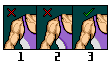
1.This example shows no blending on the outside of the shirt. This creates a sort of rough look to the lines.
2.Again, this shows pillow shading, which can look worse than simply not blending the shirt at all. This is especially noticeable when both sides of the line are pillow shading, because it makes the lines look noticeably thicker
3.To get the blended effect, simply transition the shades from light to dark along the edges, subtly blending the black lines
Blending Between Colours
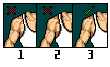
1.Shows no blending, depending on the colours used, this is sometimes more noticeable then others.
2.Another example of pillow shading. This disrupts the transition between colours, making a distinct separation between the two, rather than a smooth transition
3.Shows a smooth blending effect to the colours, this can be tricky to get a handle on. To do so, you have to find colours that compliment the two being blended, in this example purple and white. In this case, a duller purple will level out the two colours.
Tutorials:
-----------------------------------------
Start = the guys micro.... as we move through each one (left-right, up-down) is my mod until the end result.
Shading/Shaping
As you can see by the first micro, the pants are not even and they look weird around the edges. The second micro changes the outlines to curve around the legs more and to be more even. On the third I added some shading around the edges, keeping it minimal to not distract people. On the fourth one I just highlighted areas of the shading with darker areas to give it extra depth.
Notice around the edges on the body side, I added shading to smooth out the edges. Can you see the difference between the first and last? Th last one blends into the body more and doesn't stick out.
Wrist Tape
While not a big part of the micro, wrist tape is important because it can look funny and throw people off. Try to make it start on his actual wrist, where the hand stops. Some people put it higher or lower and it just looks weird. Shading wrist tape can oddly be difficult. Keep it light so it doesn't end up looking odd. ALSO, remember that if the rest of your micro has black outlines, the wrist tape should too.
Hair
Hair is something I know many people struggle with. You can see on the first that the hair recedes badly and just looks as if it's sitting on top of the head. Try to make it come down the side accurately, and add anti-aliasing to blend it in too. Don't forget to shade the hair like the rest. Not too much, not too little.
Necklaces
Necklaces tend to give people trouble, as it can be hard to curve it right. When doing necklaces, keep them thin and crisp, as seen. Add shading around the lines to smooth out any edges.
Kickpads
Boots can be trouble for many people. Kickpads were used in my example because they seem to be the most popular. You have to try to curve the kickpads around the leg just like the rest. Don't make a straight line across the legs. For kickpads, you must make the raised kicker area lighter than the back area. I tend to make the back area mostly dark, then make the kicker itself lighter with darker shading and definition.
Kneepads
I find kneepads to be quite easy to make, to be honest. Once you learn to curve it correctly around the edge, shading them can be quite easy. Add some definition to show the padded area then fill it in with a middle tone (a tone between the shading and the base colour).
Changing Body Definition
Body definition can be hard to modify, as you have to make it fit with the body and resemble the person you're making. In this case I just added another shade and added highlights to areas and elaborated on some, fixing some arm muscles and added pec detail. Just try to make it blend in, and not just stand out oddly. It comes with practise.
I just noticed there's not a thread for this in case n00bs join. Feel free to post other templates and tuts here.
-----------------------------------------
Shading
1.This demonstrates pillow shading, which is generally frowned upon, and makes your shading look sloppy and unrealistic. The effect is made by continually following the outline or shade with another shade.
2.Demonstrates cleaner, smoother shading. Rather than following the previous shade, lighter shades are used to blend the darker ones, keep reading for further info on blending
Blending/Anti-Aliasing
1.This example shows no blending on the outside of the shirt. This creates a sort of rough look to the lines.
2.Again, this shows pillow shading, which can look worse than simply not blending the shirt at all. This is especially noticeable when both sides of the line are pillow shading, because it makes the lines look noticeably thicker
3.To get the blended effect, simply transition the shades from light to dark along the edges, subtly blending the black lines
Blending Between Colours
1.Shows no blending, depending on the colours used, this is sometimes more noticeable then others.
2.Another example of pillow shading. This disrupts the transition between colours, making a distinct separation between the two, rather than a smooth transition
3.Shows a smooth blending effect to the colours, this can be tricky to get a handle on. To do so, you have to find colours that compliment the two being blended, in this example purple and white. In this case, a duller purple will level out the two colours.


