|
|
Post by Hurricane on Dec 5, 2011 19:25:52 GMT -5
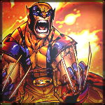
 Credit to Diablo for the logo.MS Non-Wrestling Championship Credit to Diablo for the logo.MS Non-Wrestling ChampionshipDiablo (c) vs. TC Stips: Any TV show, game or movie character that dies during it (ie. Dumbledore LOLSPOILERS)Diablo:  TC: 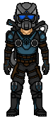 MS World Championship MS World ChampionshipCMC (c) vs. Uksix Stips: Any wrestler involved in the Invasion (WWE/ECW/WCW).CMC:  Uksix:  MS Non-Wrestling Cruiserweight Champion MS Non-Wrestling Cruiserweight ChampionErmolli (c) vs. Masson Stips: Any major character from a major film series (ie. Freddy Krueger, Batman, Darth Vader, Indiana Jones, etc.)Ermolli:  Masson:  Number One Contenders: Title of Choice Number One Contenders: Title of ChoiceJX vs. AC Stips: FreestyleJX:  AC: 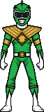 Tag Team Match: Number One Contenders Tag Team Match: Number One ContendersKOK-Cane vs. Boobs Stips: Any tag team or partners.KOK-Cane:  Boobs:  |
|
|
|
Post by Hurricane on Dec 5, 2011 19:26:51 GMT -5
I made it JX vs. AC in a #1 Contenders Match for any title, since Shaun and Next Gen didn't hand in. This match will not count as a loss for whoever does lose, since the stips are different and they weren't preparing to face each other.
|
|
|
|
Post by King of Kings on Dec 5, 2011 19:42:30 GMT -5
MS Non-Wrestling Championship
Diablo (c) vs. TC
Two awesome micros. TC's Carmine looks kinda dark in some places but has great shaping. Diablo made a bad ass Delta. The lighting, shading, and detail are brilliant.
My Vote: Diablo
MS World Championship
CMC (c) vs. Uksix
Two awesome micros here as well. Hurricane looks great, I like the hair and mask. The shading on the attire is really well done, especially the chest plate and cape. The tights are well shaded too. Kane's good. The hair and mask look good. The shaping of the body is perfect. However the legs connect to the rest of the body in an odd manner. Other than that, really good.
My Vote: CMC
MS Non-Wrestling Cruiserweight Champion
Ermolli (c) vs. Masson
Wow, Ermolli that's a great Cyclops. Could use some anti-aliasing in some places though. I love the optic blast. Great Sulley, Masson. The fur looks great. The expression is perfect, and the colors are as well.
My Vote: Masson
Number One Contenders: Title of Choice
JX vs. AC
Damn. Does this ENTIRE show have solid micros?! The detail in that Triple H is extraordinary. The resemblance is great too. JX, you've shaken off the rust, it seems. The face seems a little too round though. AC, BAD ASS green ranger. The colors are great, the shaping is great. I think the white teeth on the helmet should be blended better though. It's really tough but the shading on the green ranger pulls in a W.
My Vote: AC
Tag Team Match: Number One Contenders
KOK-Cane vs. Boobs
Good luck, boobs. Great micros.
|
|
|
|
Post by Diablo. on Dec 5, 2011 20:08:12 GMT -5
CMC vs. Uksix: Two great micros, here. Both are excellent representations of what you can achieve with your very contrasting styles; that Hurricane is very well done, everything is very smooth and that Kane is highly detailed, even the details have detail. Thus, my vote goes to Uksix for the sheer detail of his micro, however both micros were very well done.
Masson vs. Ermolli: Ermolli gets my vote here. As usual, he has pulled off something very unique and detailed, and it pays off with this great Cyclops. Masson, good work on Sulley, but the face could do with more resemblence, and the fur could do with alot more texture.
JX vs. AC: Two strong micros here. Everything about that Triple H is intense except for the lacking in facial resemblence, and the Green Power Ranger is very solid. However, JX gets my vote out of the sheer detail of that micro, but for future advice, it lacks anti-aliasing in areas (i.e. take a look at the kneepads)
KOK-Cane vs. Boobs: Boobs get my vote, simply for the epicness of Jay. Very well done, and Silent Bob looks pretty cool too, but the hands are tiny! KOK-Cane, not bad, I know Hurricane that you had to rush out that Undertaker, and it didn't turn out too bad but the blandness of the attire on yours, as well as the lack of shading and the very weird hands on KoK's Kane let your team down a bit, thus allowing Boobs to pick up the win.
|
|
|
|
Post by Hurricane on Dec 5, 2011 20:26:24 GMT -5
Diablo vs. TC
Two great micros. Diablo went all out, I love the fact he made a unique micro that isn't based on any template at all. The shading is great, as is the detail and linework. TC, great work with linework and colours, but I feel the shading is a bit flat in areas. Great work, though.
My vote: Diablo
CMC vs. Uksix
Solid micro, CMC. The best part about your micros is how clean and crisp they are. Not one of your best, but I know you were in the same burnt-out, non-caring boat that I was in for this show. Uksix, absolutely fucking brilliant. Great work, you really stepped up.
My vote: Uksix
Ermolli vs. Masson
Solid Cyclops, Ermolli. High originality points, but as I've said numerous times, I much prefer more simplistic, basic micros that are standing up and face forward. Detail and shading is fantastic, though. Masson, nice Sully. Very original. Shading is pretty flat, but since its based off a cartoon, it works. Good work.
My vote: Ermolli
JX vs. AC
JX, great work. As I said to you, the face isn't very good, but the rest is superb. AC, solid micro. Linework is good, I like the face and shoulder plates. Having said that, we've seen so many Rangers made by KOK, and this doesn't do anything to really step up and improve on the ones he did. Good work though.
My vote: JX
Tag Match:
Great work, Boobs. Very original choices. Sorry I didnt put 100% in KOK, I was really burnt out. I love your Kane's mask, and the singlet, but the hands are weird and I feel the shading is quite flat and lacking on the pants. Nice effort to make it original though.
|
|
|
|
Post by andrew on Dec 5, 2011 20:54:21 GMT -5
Diablo vs TCDiablo- WOW, you are really skilled when it comes to line work, that is pretty insane looking man. Shading on the drill looks awesome to me and love the shine on it. Love the head, I don't really see anything wrong with it TC-You did a great job too TC. This is a tough match to decide on for me. the helmet is really cool. Going to have to agree with the others when they say it looks a little flat. My Vote-Diablo CMC vs UksixCMC- Really big fan of your shading style. Cape looks great, nothing is too over shaded ad it flows nicely. The only part that looks odd to me is the shading around the belly button area Uksix-  that's badass man. The detail you put into it and the shading on that temp is just epic. Wonderful work. My Vote-Uksix Ermolli vs MassonErmolli- I like how you made this. It is not in the traditional micro pose but I'm a big fan of this style. Masson- Awesome character to choose for this stip. fur is so hard to micro and it looks like you pulled it off. The face looks really good too My Vote-Ermolli JX vs AC JX-Your shading is great, Nice work on the outfit, looks like it took some time to make. I like the little details you put on his face and his necklace looks badass AC-Looks nice and clean. Shading is great but I feel the gold parts could be a little better. Great work on the helmet though, looks great My Vote-JX KOK-Cane vs BoobsKOK-Cane-Nice micros guys, The tats look badass. Not really anything else I can think of to say Boobs-These are cool, Shading looks clean on both of them, tough to pick between both these teams though. My Vote-Boobs
|
|
|
|
Post by Alex on Dec 5, 2011 21:09:02 GMT -5
MS Non-Wrestling Championship
Diablo: really like the helmet and the drill. Shading on those is really good, and all the details look great. Very good linework and shaping too
TC: Shading is good, but for a GOW dude the shaping looks too small and frumpy. A bigger temp would help here
Vote: Diablo
MS World Championship
CMC: its cool but doesnt stand out a whole lot among your work. I think his shoulders and neck make his upper too bulky as well. Shading is good as always
UKsix: looks great, really like the temp. The translucent shirt effect is very well done, the attire overall is really good, except the boots look a bit plain, maybe some laces would help
vote: UKsix
MS Non-Wrestling Cruiserweight Championship
Ermoli: Very original, i really like the muscle detail throughout, and the pose is fantastic. I really like the comic book feel of it. My only crit is the forearms look a bit weird and long
Masson: Another original choice, its matches like these that make me prefer the NW divisions a lot more. Fur effect is well done, maybe a tiny bit more contrast in the shading would help, but i like it quite a bit.
vote: closest match here but going for Ermoli
#1 Contender Match
JX: Face is a little weird and dark, but i like the rest a lot, some AA could be used in spots, but the attire looks really good, especially the fur
AC: Pretty good, i find power rangers dont make for the most interesting micros though. Maybe some shine throughout the gold parts would help it pop more.
Vote: JX
Tag-Team Number One Contenders
KOK-Cane: Dunno if the Undertaker is a revamp of the old one but it looks familiar. Very good, anyways. I like Kane's mask a lot, i feel like the arms are too big though, and the hands a bit weird
Boobs: Jay looks really good, even the little logo on the chest. Nicely done, only crit is the grey part of the lightsaber looks flat. Silent Bob's attire is also very good, face could be wider though, and he looks a little small by comparison
vote: Boobs
|
|
|
|
Post by AC on Dec 5, 2011 22:45:04 GMT -5
MS Non-Wrestling Championship
Diablo (c) vs. TC
Both guys did a great job but I gotta give it to Diablo. Fantastic micro from top to bottom. I really enjoy TC's as well but Diablo's is just awesome.
MS World Championship
CMC (c) vs. Uksix
Gotta go with Uksix. I freakin love it, one of the best Kane's I have seen. CMC did great as well but I feel like the likeness on the face could have been better where as Uk nailed Kane's mask perfectly.
MS Non-Wrestling Cruiserweight Champion
Ermolli (c) vs. Masson
Masson is getting my vote. The fur looks awesome and everything is great. I like Ermolli's but I'm not sure if I would consider it a micro or not :/
Number One Contenders: Title of Choice
JX vs. AC
Good luck JX. Nice H micro
Tag Team Match: Number One Contenders
KOK-Cane vs. Boobs
Good luck KOK and Hurricane. Nice micros
|
|
|
|
Post by Hurricane on Dec 5, 2011 23:33:53 GMT -5
Taker isnt a revamp, I made it from scratch, I just didnt put in the effort to make it stand out or original, due to being so burnt out.
_________
Diablo: 5
TC: 0
CMC: 1
Uksix: 5
Ermolli: 4
Masson: 2
JX: 4
AC: 1
KOK-Cane: 0
Boobs: 3
|
|
haasamaniac
Backyarder
 MS Cruiserweight Champion
Posts: 196
|
Post by haasamaniac on Dec 6, 2011 1:19:18 GMT -5
MS Non-Wrestling Championship
Diablo (c) vs. TC
Two amazing micros here. Diablo, the drill is awesome and the shading and detail is great. I really like the shine and the light coming out of the lightholes (or whatever you call them) is nice. TC, the helmet is great and overall it's a very solid and detailed micro however it's not as eye catching as Diablo's.
My Vote: Diablo
MS World Championship
CMC (c) vs. Uksix
CMC, as others have said it's very clean and crisp, the shading is great as always, especially on the chesty cape bit. Kane looks awesome, I really like the shirt and the mask.
My Vote: Uksix
MS Non-Wrestling Cruiserweight Champion
Ermolli (c) vs. Masson
Cyclops is very original however some of the shaping (like the forearms) look off. Shading is generally very good although the neck shading looks odd. Masson, you really captured Sulley. Great job on the fur.
My Vote: Masson
Number One Contenders: Title of Choice
JX vs. AC
Triple H looks good but the face is off as is some of the body shading (like the thighs), the rest looks good, the fur on the cape and lower body looks great. AC, good work it looks nice and clean.
My Vote: AC
Tag Team Match: Number One Contenders
KOK-Cane vs. Boobs
KOKCane, both micros are really good. Undertakers tats are awesome and Kane looks great too however the hands look a bit odd and the tights look a bit flat. Boobs, great work both micros look nice especially the one on the left.
My Vote: Boobs
|
|
|
|
Post by Hurricane on Dec 6, 2011 2:20:16 GMT -5
Diablo: 6
TC: 0
CMC: 1
Uksix: 6
Ermolli: 4
Masson: 3
JX: 4
AC: 2
KOK-Cane: 0
Boobs: 4
|
|
|
|
Post by Diablo. on Dec 6, 2011 5:06:53 GMT -5
Everyone's been commenting on my linework... but what exactly is linework? Just how I did the outlines?
|
|
|
|
Post by Splasher on Dec 6, 2011 7:48:20 GMT -5
Everyone's been commenting on my linework... but what exactly is linework? Just how I did the outlines? Pretty sure it's just the outline. Votes: Diablo (c) vs. TC Nothing I can say that hasn't been said. Vote for Diablo. CMC (c) vs. Uksix CMC's micro has great resemblance, colours, AA, shading and shaping. Can't say the same about Usix's Kane. Vote for CMC. Ermolli (c) vs. Masson " Splasher Ermolli ... that entry from you is really more of pixel art rather than a micro." "Thing about this is, though, it's not really a micro, more just pixel art." "Assuming that this is a micro I still would vote AC Masson. It's a cool idea Splasher Ermolli, but the legs look weird and the arm is too long."  To summarize, Ermolli's micro is Pixel Art, the shading is odd in some places (neck) as is the shaping (forearms). Masson's micro looks great, the colours and the resemblance are pretty amazing. Some AA on the hand detailing, crotch area, armpit area and the outline of the body would've made this flawless. Vote for Masson. JX vs. AC JX's micro's detail is great, but the thigh shading is... odd? The eyes/face in general could be better. AA on the kneepads would've been good too  AC, plain and simple, I don't like the micro. I know that sounds harsh, and I can't pinpoint what's wrong with it. I just... don't like it? lol. With that being said, there is nothing wrong with the shaping/shading (except maybe the boots). Vote for JX. KOK-Cane vs. Boobs I'm gonna go with KOK-Cane because of the Undertaker's face/tattoos and Kane's upper body. Also, WTF at Kane's hands  |
|
|
|
Post by Diablo. on Dec 6, 2011 8:01:06 GMT -5
Ermolli (c) vs. Masson " Splasher Ermolli ... that entry from you is really more of pixel art rather than a micro." "Thing about this is, though, it's not really a micro, more just pixel art." "Assuming that this is a micro I still would vote AC Masson. It's a cool idea Splasher Ermolli, but the legs look weird and the arm is too long." To summarize, Ermolli's micro is Pixel Art, the shading is odd in some places (neck) as is the shaping (forearms). Masson's micro looks great, the colours and the resemblance are pretty amazing. Some AA on the hand detailing, crotch area, armpit area and the outline of the body would've made this flawless. Vote for Masson. No, it's a micro. It's a front facing character in pixel art form of micro size. Does it stretch the bounds of the term micro? Yes. But that's what makes it that much more unique. Plus, a micro is pixel art anyway. I don't get why a new guy like you would even be using the pixel art vs. micro argument, anyway. |
|
|
|
Post by Attitude Adjusted on Dec 6, 2011 9:15:25 GMT -5
Because he got that argument on a micro of his over at CAWs.
|
|


 that's badass man. The detail you put into it and the shading on that temp is just epic. Wonderful work.


 AC, plain and simple, I don't like the micro. I know that sounds harsh, and I can't pinpoint what's wrong with it. I just... don't like it? lol. With that being said, there is nothing wrong with the shaping/shading (except maybe the boots).