|
|
Post by andrew on Oct 16, 2011 9:43:05 GMT -5
so this is still a wip, but I wanted to micro something simple and I think i messed up on some things. 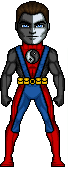 Right now I am not happy with how the symbol on his chest came out and how I shaded the blue part on his upper body. some opinions on this would be great to hear and also if anyone has a better color to blend black and white together that would be really helpful. thank you everyone  |
|
|
|
Post by Alex on Oct 17, 2011 0:47:35 GMT -5
Here's the edit i posted in the chat, like i said ill explain better here, just zoom in on bits to see what i mean 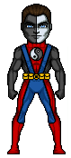 Like i said, the ying yang shading was just a bit too crowded before, try to keep the shading to the outer edges and some slight AA on the inner lining. Also a more subtle change i made is to the blue suspender-things. You AA'd the lines which is totally appropriate but i fnd when you use the same length of pixels for AA as the line beside it, it still tends to give a pillowy effect. (hopefully that makes sense) So rather than three pixels of AA i just made it 2 |
|
|
|
Post by andrew on Oct 17, 2011 13:52:36 GMT -5
ah yes I get what you mean now, to tell you the truth i did not notice you did that until you explained it. Thanks for the help man, I appreciate it.
|
|
|
|
Post by Masson on Oct 17, 2011 14:01:37 GMT -5
More on the AA side of things, it looks like you've done too much on the legs where the red meets the blue, making the line look quite blurry in places.
|
|
|
|
Post by andrew on Oct 17, 2011 16:56:32 GMT -5
ok thanks man, I have no idea when I will be done with this micro as i have a lot of projects I'm working on but hopefully it will be done within the week. thanks again  |
|