|
|
Post by Hurricane on Mar 11, 2014 7:58:04 GMT -5
 With AC pulling out of the World Title Match, Hurricane stepped up on two days notice and will face the Micro Rumble winner, Ermolli, for the MS Interim World Championship. This is 100% considered a World Title win for the victor of this match, who will go on to face AC at a future event to crown the MS Undisputed Champion.MS Interim World Championship With AC pulling out of the World Title Match, Hurricane stepped up on two days notice and will face the Micro Rumble winner, Ermolli, for the MS Interim World Championship. This is 100% considered a World Title win for the victor of this match, who will go on to face AC at a future event to crown the MS Undisputed Champion.MS Interim World ChampionshipErmolli vs. Hurricane Stips: Any DC Comics Character OR Any wrestler who had a match at any of the last three Summerslam events.Ermolli:  Hurricane: 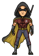 MS Tag Team Championships: Grudge Match MS Tag Team Championships: Grudge MatchJ-Gaveration X (c) vs. HurriClaAsick Stips: Any stable or group, wrestling or non-wrestling. Each microer makes 2 micros.J-Gaveration X: 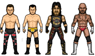 HurriClaAsick: 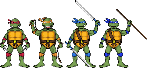 Exhibition Match: Exhibition Match:Next Generation vs. Masson Stips: Any wrestler who has held a World title in two or more promotions out of WWE/TNA/WCW/ECW/ROH.Next Generation:  Masson:  Special Throwback Match: Special Throwback Match:Hurricane vs. SPZ Stips: Use the classic template/similar one (Look at old Throwback PPVs) to create a Throwback micro!Hurricane:  SPZ:  |
|
|
|
Post by Hurricane on Mar 11, 2014 8:23:31 GMT -5
World Title Match:
Amazing micro, Ermolli. While I really like how mine turned out, especially in such a short time, you deserve this one! Amazing. Good luck.
Tag Titles:
Interesting choice guys, good luck. I think Crispin Wah's face needs to be a bit higher on his head, he looks like he has down syndrome. Same with Malenko, both of the faces seem vertically squished. I see resemblance on Malenko, nonetheless. JX, I really dislike this blur tool you use. Both look like great micros but are wrecked by the blur, in my opinion.
Next Gen vs. Masson:
This is difficult. Next Gen, I really like yours, aside from a few things. First, the sad eyebrows, once again. Funnily enough, it makes him resemble one of his most famous rivals, Terry Funk. Weapon was a good addition, as was the blood. Hands lack shading. Leopard print is really good. Masson, this is a really solid micro, but I honestly feel it doesn't improve on any of your past Punks really. It has a bit of resemblence, pose is good, etc. but I feel you can do better.
My vote is.... Masson.
SPZ vs. Hurricane:
SPZ, REALLY great micro idea, but execution is just... eh. His hair is square, he looks like a demonic crackhead and your shaping just doesn't flow. Rather than having natural looking angles, you have weird ones that stop it from flowing, especially on the elbow of the posed arm. Really great, out of the box idea, but I feel you really need to take more criticism and try to actually improve, as you've been at the same level for like.... 3 years.
|
|
|
|
Post by Masson on Mar 11, 2014 11:00:22 GMT -5
World Title Masson, this is a really solid micro, but I honestly feel it doesn't improve on any of your past Punks really. I've never made a Punk micro before, so I don't know what you're thinking of exactly, lol. Will vote later. |
|
|
|
Post by SPZilla on Mar 11, 2014 16:23:03 GMT -5
SPZ vs. Hurricane:SPZ, REALLY great micro idea, but execution is just... eh. His hair is square, he looks like a demonic crackhead and your shaping just doesn't flow. Rather than having natural looking angles, you have weird ones that stop it from flowing, especially on the elbow of the posed arm. Really great, out of the box idea, but I feel you really need to take more criticism and try to actually improve, as you've been at the same level for like.... 3 years. i made it look bad so it can be like old school spz  |
|
|
|
Post by Alex on Mar 11, 2014 16:25:25 GMT -5
MS Interim World Championship
Ermoli: Love this Deathstroke design, and you captured it really well, the mask and armour look great.
Hurricane: Very cool Robin, but the design just doesn't pop as much to me. Still quality work in the shading and shaping.
Vote: Ermoli
MS Tag Team Championships: Grudge Match
J-Gaveration X: Benoit and Malenko have solid resemblances, but the attires are a little boring. JX, you can tell there's some good micros buried under there, but to be honest, the blur effect makes them look terrible.
HurriClassick: Very nice, original choice of characters. Love the cartoony look and shading. My only nitpick is Donatello's mask looks a little more blue then purple.
Vote: HurriClassick
Exhibition Match:
NG: I don't see a ton of resemblance in the face but I like the rest quite a bit. Especially the Plaid and pattern on the tights. The shirt design is also really good. I'm not so keen on the way the hand is holding the bat though, looks a little awkward.
Masson: Again, don't see a ton of resemblance in the face. I like the attire, especially the boots/kickpads, but the tattoos on the arm could blend a little more.
Vote: NG
Special Throwback Match:
Hurricane: I really like your work with your throwback temp. This fits the old school look but doesn't look any less polished then "new-school" micros.
Spz: Shaping and shading still need a lot of work
Vote: Hurricane
|
|
|
|
Post by TC on Mar 11, 2014 17:54:21 GMT -5
Pretty sick entries. I'll vote on this after work later tonight.
|
|
|
|
Post by AC on Mar 11, 2014 18:15:51 GMT -5
MS Interim World Championship
Ermolli vs. Hurricane
I was making Deathstroke as well, so this would have been a very interesting match if I had been able to get it done.
Ermolli: I think it's great and can't find any flaws at all. Would have been even better with a pose of him holding the sword.
Hurricane: Another great micro, especially for being last minute haha. I really like it and can't find anything wrong.
It was a hard decision, but I think I gotta give it to Ermolli. His stands out to me more, but it was a really difficult decision.
Exhibition Match:
Next Generation vs. Masson
NG: Nice work on the flannel, as well as the leopard print on the tights and boots. Not much resemblance, but everything else makes up for it, imo.
Masson: The attire is good, but I don't see much resemblance. The tattoos look a little too bright as well.
Going with NG. Both are good and both have their spots for improvement, but I feel NG did the better job this time.
Special Throwback Match:
Hurricane vs. SPZ
Hurricane: I dig it. I think you captured the old school feel really well, while still making it look more up to date.
SPZ: It's alright. I'll give you a nod for trying something different, but it could have been pulled off better. The eyes looks huge too, like a waterbug.
Voting for Hurricane. It's really not much of a match, imo.
Good luck to JGX as well
|
|
|
|
Post by Next Generation on Mar 11, 2014 19:42:42 GMT -5
Hurricane v Ermolli
Really liking both entries here. Cane, for only 2 days to make a micro it looks great but that Deathstroke is top notch and i cannot see a fault in it.
Vote: Ermolli
JGX v HurriClaasic
Good work on the attires JGX, a couple of the faces lack resemblence in particular the Benoit & Guerrero micro's IMO but other than that pretty solid work. TMNT is the Jizz! and the micro's looks awesome and 10/10 for originality.
Vote: HurriClaasic
Hurricane v SPZ
Great stuff Cane, it looks fantastic. SPZ....Same old Shit although i will give you credit because it is really hard to copy/paste an old micro head
Vote: Hurricane
|
|
JX
Rising Star
 I am the best there was, The best there is, The best there ever will be.
Posts: 839
|
Post by JX on Mar 12, 2014 2:21:03 GMT -5
Hold on...Why is my Eddie and Perry blurry? Cause that's not how I sent them haha.
|
|
|
|
Post by Next Generation on Mar 12, 2014 2:53:28 GMT -5
Shit, 2 votes against Masson i am quite pleased
|
|
|
|
Post by Hurricane on Mar 12, 2014 4:48:46 GMT -5
Hold on...Why is my Eddie and Perry blurry? Cause that's not how I sent them haha. I copied the link you sent me. If you have a non blurry one, just PM it to me and I'm happy to repost the match to get people to vote again. Sometimes image hosting sites do that. |
|
|
|
Post by Next Generation on Mar 12, 2014 8:31:03 GMT -5
I thought the blurry look was intentional lol
|
|
|
|
Post by Ermolli on Mar 12, 2014 14:08:41 GMT -5
Hurricane, great Robin. It looks really good considering you only had a couple of days to do it. Good luck.
Next Generation vs Masson
Next Gen: Solid micro. Looks great overall, the attire is well done, but it still lack some depth to it, especially in the vest, which lacks shading as well. Great micro.
Masson: I really like this CM Punk, the pose is really well done, and i can definatelly see the resemblance, however there is something with the face that i dont quite like. The attire looks good.
Both micros are really good, but i have to go with Masson on this one.
Hurricane vs. SPZ
Hurricane: The throwback style was well executed. The attire looks nice and the shading looks good as well.
SPZ: Nice try with the pose but it looks kinda weird. The eyes creeps me out, and the shading needs work. You have to work with the AA.
My vote goes to Hurricane.
I'll wait till the non-blurred versions of JX's micros are up to vote on the tag match.
|
|
|
|
Post by Gav on Mar 12, 2014 15:52:14 GMT -5
MS "Winner gets a title but isn't really a champion" Championship
I wish more people would type the name of the micro in the save file name so I can see who it is in the properties (e.g. deathstroke2.png.) Luckily someone else mentioned the name so I know who it is now, but that was just a mini rant.
Deathstroke looks awesome. Packed full of detail and design with great use of shading. Robin's good but it just doesn't grab my attention. Seems a little flat and washed out by comparison.
Ermolli here.
Tag Match
I never usually mention my matches but since Joshtopher did so, I will. I initially did have Crispin's face higher, like you suggest, but it didn't look as good as this version. And they may have "boring" attires but they don't exactly wear fancy Fandango pants do they? There are other colour schemes I could've gone with but that shouldn't matter.
Something that's been on my mind for a while too is the following. We need to stop the stips which can lead to wrestling vs non-wrestling people. The Turtles are cool and all (if a little impersonal because if it weren't for Cane's head shading style I wouldn't know who made what) but it can put wrestling at a disadvantage when you can create something awesome like that and the Radicalz are limited by what they look like. What if SPZ makes a nice CM Punk and Dave does a cool robot? There's no way to directly compare the two.
Exhibition Match
Some nice designs on Foley, particularly on the shirts, but don't see much in the head. Barbwire baseball bat has no depth to it either. Great pose on Punk, showcasing a head we rarely see and a look at inside tattoos that are never done. I like it so Masson gets my vote.
Special Throwback Match
They are what they are and I'll judge this as if we were back in time 8 years or so. With that in mind, CM Punk would've amazed me because we never saw poses back then. If there were, they were stock template ones and SPZ has went a mile with this custom pose. The shirt design is very inaccurate but the head's not bad. I just love the shaping of the legs. Nice enough shading on Hurricane by his namesake but that's about all I can say here. So SPZ has done enough for me.
|
|
|
|
Post by AC on Mar 12, 2014 17:33:02 GMT -5
Something that's been on my mind for a while too is the following. We need to stop the stips which can lead to wrestling vs non-wrestling people. The Turtles are cool and all (if a little impersonal because if it weren't for Cane's head shading style I wouldn't know who made what) but it can put wrestling at a disadvantage when you can create something awesome like that and the Radicalz are limited by what they look like. What if SPZ makes a nice CM Punk and Dave does a cool robot? There's no way to directly compare the two. I don't agree at all. You guys didn't have to make anything wrestling related. So I don't really see how it puts anyone at a disadvantage. If we flipped it and you guys made the turtles and we made the radicalz, I wouldn't say it's unfair. |
|