|
|
Post by Masson on May 31, 2014 14:49:01 GMT -5
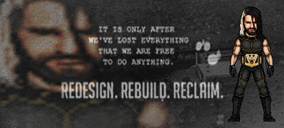
Undisputed Title:
Vote goes to Ermolli. Honestly, I don't think either are a best micro. I dislike the torso shading on the Warrior, while the actual shading is good, I don't think the shape of the pecs or abs are quite right. Otherwise, it's fantastic, I mostly like the hair.
Cane, the title looks great and the torso is top notch, I feel the tights are a little flat and the shoes could add more detail. Although the thing that really lets this down is the face, Unfortunately it looks nothing like him, and the hair should really be lighter. Had you claimed this was Justin Hawkins in Shawn Michaels attire, you'd probably get my vote...
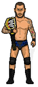
KOK vs NGW
Kok gets my vote. Great micro throughout. I very much like the shading, especially on the metal on the chest and shoulders. Hands are a bit oddly shaped but that is minor and unnoticeable really. Cape could do with some shading though imo.
NGW, I really like this, especially the shirt and tattoo, and the face isn't too bad either, pretty good actually. Unfortunately the beard kinda lets that down though. What I really dislike about this is the rigid shading on the trousers, which has bad flow and looks like it's made of metal or something.
Cruiserweight Championship.
Wow. Hard vote. Both step out of their comfort zones and produce really nice micros. Dave, this face looks tremendous and the shaping is very good on the body, too. I dislike the shading though and it looks very out of place in spots, mainly the arms but the belly could use work too. Big gripe I have with this is the face looks like fur, but the body looks like Plasticine.
SPZ, slightly flat looking and the feet look weird, but otherwise a really good micro and the designs of the clothes and face look very good.
I'm voting for SPZ.
|
|
|
|
Post by Lord KIP on May 31, 2014 14:52:16 GMT -5
Alrighty my friends first time voting for a few years...
Disclaimer: For those who don't remember I am through with my critiques. I focus more on the negative because that is what someone can use to improve. I am not aggressive in anyway; I am just not a sunshine and rainbows kind of guy.
MS Cruiserweight:
Dave: Dead On. Shading is relatively simple, but that is what a cartoon should have. (one of the reasons I am not too huge on cartoon micros)
SPZ: I am not a fan of this Micro. Texture and Detail are well done but outside of the blob in the hair and the shadow on the eyes I see no shading. The detail in the dress masks this a bit but I really think that choosing a different character and showing the shading would have benefited you much more.
VOTE: Dave
Special Exhibition Match:
KoK: Looks like you ran out of time on this one. If you delete everything below the wrist it looks great. The lower body seems awkward and ill proportioned. The lack of the shading on the cape really takes from the depth of the micro over all. Still I love the top half.
Next Gen: White is a bitch to shade properly. I am not a fan of the shading in the pants. My biggest complaint is that you relied too much on the template. Wyatt needs to be husky and you could have accomplished a lot more by shading his gut on him. Texture in the beard and hair is great but the beard is too uniform.
VOTE: KoK
Grudge Match:
It's a shame there was no turn in from TC. Cane this is a great micro. Looks simple at first glance but there is really good detail and solid shading when needed.
MITB:
Masson: I dig the pose. Face is not bad but not great. Biggest issue I see here is the shaping on the neck and legs. The necklace looks to be a part of the body and not an added article. The legs need to taper off a bit more. Some sort of indentation for his knees would have drastically improved his over all look
JX: I love the muscle definition but that is for not Andre. The head has huge potential but has two major flaws in my opinion: missing the sideburns and the angle prevents us from seeing that trademark Andre forehead. Otherwise the head looks Awesome. The Body is what kills this micro for me. The line leading up to the strap looks unnatural. Extending and widening his torso would really help pull that together. The boots do not line up with his knees leaving his legs awkward looking. I can see the work put into this all it really needs is some attention to detail to help make it Andre and not a micro from a template that resembles Andre.
Gav: There is one major issue I have with this one. It is too small. I like it and I can tell what you were going for but it is too small for me to pinpoint much. The one detail I see that hinders the micro is that there is no clear bend in the leg and for it makes it look more like a midget on stilts.
VOTE: Mason
Main Event:
Ermolli: I really like this micro. The torso is amazing; that is what sells me on it. I see some shaping/proportion issues with his arms and legs but it does not detract too much from the overall micro. The one thing I can say would really take this micro to the next step is shading on the face. The paint is a little too flat me.
Cane: Pose is great. I love the belt. The thing that stands out for me on this is the face. I see the resemblance but the eyes detract from that. I think shrinking the eyes a tad and maybe giving him a little smirk would really pull it together.
VOTE: Ermolli
|
|
|
|
Post by Ermolli on May 31, 2014 15:00:56 GMT -5
Great HBK, Cane.
Money in the Bank Ladder Match
Masson: That Umaga looks awesome. I really think you nailed the shaping of his body. Attire looks great, and the tatoos too. The face needs some work but it's still good.
JX: Great Andre. He looks huge as he should. The face and expression is perfect. Looks just like him. The attire is simple but still well done. However he looks too ripped.
Gavsca: Looks great. The face and pose is well done. I can see the resemblance. I'm not really liking the shading on the shirt.
My vote goes to Masson.
Special Exhibition Match
King of Kings: It really caught my attention. I like it. The body shaping looks off. Maybe it's the size of the shoulder armour compared to the legs, idk. The armour lacks shading but it's still a good micro.
Next Gen: Nice Wyatt. I like the attire for the most part. The black shirt lacks shading, but the rest is well done. Great resemblance. Also, the body should be wider and fat.
My vote goes to Next Gen.
MS Cruiserweight Championship
Dave: I really like this micro. Everything looks great. Nice work on the body and face.
SPZ: It looks good for the most part but needs work. I like how you made the clothes and the "sewed effect". The face looks kinda weird, as well as the shaping in some places.
My vote goes to Dave.
|
|
|
|
Post by Alex on May 31, 2014 15:56:31 GMT -5
MS Undisputed Championship:
Ermoli- While the mullet isn't the first hairstyle I associate with Warrior, the rest looks absolutely spot on. The texture to the skin is really original and the musculature is top notch. The facepaint and attire are very well done
Hurricane: the pose and body detail are also really good here. The designs on the tights are esopecially nice. I'm not too fond of the face however, and the hair color and style doesn't immediately strike me as HBK.
Vote: Ermoli
Money in the Bank Ladder Match:
Masson: I like the face a lot, but the overall size and proportions look midget-like. There's some nice detail in the tats and attire though
JX: Very nice work on the face, looks just like him. Usually I'd find the head pointed up to be a detriment but it somehow works on Andre. The temp throws it off a bit however. The body could be fatter and the skin is a little too grey-ed out.
Gav: I also feel this one suffers from being too small. There's some nice detail in the face, but you really gotta focus to see it. I think what's throwing the shirt off, shading-wise is the highlights, they give it a plastic-y texture.
Vote: JX
Grudge Match:
Hurricane: Love this one, maybe my favourite on the card. Matches the style of the cartoon beautifully while still retaining your shading style
Special Exhibition Match:
KOK: I REALLY want to like this one, it's an awesome choice in character, but I just feel it falls flat. The shading is really hap-hazard and the most glaring issue is the tiny legs. There's some great linework in the upper half of the micro but these issues really let it down.
Next Gen: I don't know the character other than some pics people have posted here, but from what I gather he could be a bit fatter. The face and shirt are really good however. The pants aren't bad but try not to fall into the trap of just shading with diagonal lines over and over again.
Vote: Next Gen
MS Cruiserweight Championship:
Dave: Like I said on MIB I really like this one. The shading is pretty crisp overall and it matches the character quite well
Spz: Probably one of your best but it still has shading issues here and there. Very nice linework though
Vote: Dave
|
|
|
|
Post by Next Generation on Jun 1, 2014 11:03:22 GMT -5
It looks like it is going to be another 'so close yet so far' result for myself haha.
|
|
|
|
Post by Hurricane on Jun 2, 2014 0:26:07 GMT -5
3 muffins, a skinned ferret and a pound of Brazillian crack for whoever tallies this?
|
|
|
|
Post by Masson on Jun 2, 2014 6:04:33 GMT -5
Ermolli 4
Cane 3
JX 3
Masson 3
Gav 1
KoK 4
NGW 3
Dave 7
SPZ 2
Pretty damn close for the most part.
|
|
JX
Rising Star
 I am the best there was, The best there is, The best there ever will be.
Posts: 839
|
Post by JX on Jun 2, 2014 7:37:46 GMT -5
Wow, very close indeed!
|
|
|
|
Post by Hurricane on Jun 2, 2014 9:21:25 GMT -5
As a whole, this is the closest pay per view ever. Awesome stuff. Hopefully we can get one or two more votes. |
|
|
|
Post by Gav on Jun 2, 2014 11:57:34 GMT -5
MS Undisputed ChampionchipsI think the muscle definition on Warrior is pretty fuckin' sweet. I like to mod my torsos to fit the definition of the guy I'm doing too so this is very well done. I like everything about it actually. Unique pose on the HBK. Tight designs and belt in particular are my personal highlights. Not seeing any facial resemblance at all but it's understandable considering the circumstances. Overall I'll give the edge to Ermolli.Fudge MatchVery nice micro Cane. TC, I don't see the resemblance. Cane here.  Special Brew Exhibition Match Special Brew Exhibition MatchArthas looks fantastic and well detailed but it's a shame the cape shading was overlooked. Bray has resemblance and the shirt's nice but the pants seem odd to me, like the natural contour and shape of a leg has not been followed shading wise. I would've had his legs much closer together, like Ermolli did with Warrior earlier. KoK gets my vote. MS Cruiser-who-ate-all-the-pies and Championchips?I like the look, if not the shading detail, of SPZ's very much. One of his best I'd say. Dave has produced an excellent micro too and I like how it's come out. It's different to what we might normally expect. Dave here.
|
|
|
|
Post by AC on Jun 2, 2014 18:39:24 GMT -5
MS Undisputed Championship:
Ermolli (c) vs. Hurricane
I really like both, but I'm going with Ermolli. The colors are more eye catching to me, but both are great micros. Love the work on the belt on HBK.
Vote: Ermolli
Money in the Bank Ladder Match:
Masson vs. JX vs. Gavscsa
Going with Gav. It's something different. All three are pretty solid micros, but I feel like Gav went the extra mile with the wheel chair and all.
Vote: Gav
Awesome Cooler, Josh. I love it.
Special Exhibition Match:
King of Kings vs. Next Generation
Going with NG. The proportions on KOK's kept me from voting for him, the legs look really short compared to the upperbody. Nice Bray NG, the pants shading could use a little work but aside from that everything else is good.
Vote: NG
MS Cruiserweight Championship:
Dave (c) vs. SPZ
Going with Dave. The shading is really good, imo. SPZ's is good, but the shading lacks as always.
Vote: Dave
|
|
|
|
Post by Hurricane on Jun 2, 2014 23:03:57 GMT -5
Ermolli 6 Cane 3 JX 3 Masson 3 Gav 2 KoK 5 NGW 4 Dave 9 SPZ 2 Pretty damn close for the most part. |
|
|
|
Post by Hurricane on Jun 5, 2014 0:21:22 GMT -5
I guess that's done!
Winners are Ermolli, Hurricane (via forfeit), King of Kings and Dave.
For the first time, there are TWO money in the bank winners since it was a draw! Masson and JX both get a briefcase to use when they want. The rule is that you have to use the Champions LAST POSTED micro, and you have to use a similar micro (wrestling against wrestling, non wrestling against non wrestling). Otherwise you can choose to use it to get a PPV headline match for the title with stips of your choosing.
|
|
|
|
Post by Next Generation on Jun 5, 2014 0:37:15 GMT -5
Congratulations to all the winners. No one should feel like they have lost this Micromania was the closest one all round. Thank you KoK for accepting my challenge, much appreciated.
|
|
|
|
Post by King of Kings on Jun 5, 2014 2:30:38 GMT -5
Congratulations to all the winners. No one should feel like they have lost this Micromania was the closest one all round. Thank you KoK for accepting my challenge, much appreciated. Thanks for the match man. That was a dope fuckin micro and I think you should have won but hey, fuck, you're still fuckin dope in my book. I think we should have a rematch somewhere down the line man. You're a sick artist, and I love that Bray Wyatt micro. |
|