|
|
Post by Hurricane on Feb 6, 2010 17:43:53 GMT -5
 I gather theres no interest in drawing, but graphics shows will continue. Graphics World Championship:TC vs. King of Kings vs. eMasson Stips: Any advertising banner. Can be advertising a WWE PPV, Microstop, band tour, a brand, etc. Anything. TC:  King of Kings:  eMasson:  Get voting! Good luck to you three. |
|
|
|
Post by Hurricane on Feb 6, 2010 17:46:49 GMT -5
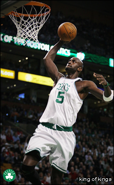
TC, I love the crispness of yours. It stands out and looks extremely professional. KOK, I feel yours is too big and doesn't catch the eye as much. It's a decent effect, but at the end of the day its just a picture, really. Still, much better than I could do. eMasson, I like yours but I feel it's a bit too corny. The fluoro colours are a bit off-putting and you don't really need to name every person on the board. You spelled "Picture Editing" wrong, too. I like it though.
My votes for TC.
|
|
|
|
Post by mach3gillette on Feb 6, 2010 18:03:49 GMT -5
TC:
Like yours, it's crisp as 'Cane said, but I find it a bit plain. Love the lettering though.
KOK:
Yours looks pretty much like a picture with a slight filter on it and it's pretty damn big which is a little bit off putting.
eMasson:
It's a bit too bright and as 'Cane said a little bit corny because of the colors. Catches my eye though.
My Vote: TC
|
|
|
|
Post by Masson on Feb 6, 2010 18:10:16 GMT -5
The colours I used are the colours that are used in the graphics, although, I am contemplateing changing the graphics soon... And sorry for that typo, too.
|
|
|
|
Post by TC on Feb 6, 2010 18:35:49 GMT -5
Glad I'm winning so far.  I agree with you Mach about mine being plain. I tried adding more but it just looked too crowded. Not really sure what you did to yours KOK. To me it just looks like a picture with a film grain effect and an added logo. eMasson, I don't really like it. The colors are very bright and eye-catching, but it's still quite plain. Also, why is the same Cena on both sides? |
|
|
|
Post by Masson on Feb 6, 2010 19:17:55 GMT -5
Well, I originally made this, for the banner of my micro show,And nicked the same micros from each side. Made it a bit quicker for me, tbh.  I was planning on just getting the best micros I could find, but I didn't really have the time. |
|
|
|
Post by Hurricane on Feb 6, 2010 20:00:24 GMT -5
That thing looks cool, except that some of the micros on the left side have parts deleted. Like in Jericho's and Luke Gallows' arms, the people behind them are replaced with white.
|
|
|
|
Post by CMC on Feb 6, 2010 22:08:30 GMT -5
Going for TC. Looks nice. Eye catching and the orange obviously fits with what we have. Nice work KOK but not much has been done. Good work eMasson but I agree with it looking corny
TC
We should use that for the forums logo aswell. Better than my shitty one which is still there.
|
|
|
|
Post by Hurricane on Feb 6, 2010 22:12:35 GMT -5
I did have it on for a little while, but its not long (wide) enough.
|
|
|
|
Post by TC on Feb 7, 2010 7:47:30 GMT -5
 Resized. Now will it fit? |
|
|
|
Post by Alex on Feb 7, 2010 21:16:46 GMT -5
My vote goes to TC as well. It’s combines all the theme colours of the board really well and I think it would make a great banner for the board. KOK its good but the stip was an advertising banner and this doesn’t really fit the dimensions of a banner, looks more like a poster. But the actual graphics are cool, the effect makes the colours in the background look really cool. Emasson, not a big fan of the colours but its effective for advertising I guess, which is the point of the stip I think. However its something ive seen plenty of times before, a banner w/ boards name + lineup of micros, maybe a better way to incorporate the micros would make it more memorable
Vote: TC
|
|
|
|
Post by Hurricane on Feb 7, 2010 23:24:24 GMT -5
Resized. Now will it fit?  no. |
|
|
|
Post by H Y T M A N on Feb 8, 2010 0:27:43 GMT -5
I think that some burning on the right hand side of the banner would do it justice. Maybe a nice big patch of lighting somewhere near the 'MS" would look nice as well.
TC gets my vote.
|
|
|
|
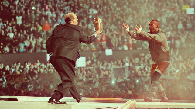
Post by King of Kings on Feb 8, 2010 0:58:08 GMT -5
I don't mean to be one of 'those guys' or anything, but I've done far more than just add a filter to a photo. I really DON'T want to come off that way, please don't think of me being like...one of those 'sore loser' kinda guys, I'm just saying.
I've added rays of light, fixed the contracts and light curves, blurred the confetti, gave a smokey and grainy look to the image, and slapped the new GN'R logo on it.
When someone says "Looks like you've just added a filter to a photo" it kinda feels insulting.
It's like if you said "Looks like some special effects added to some text" to TC's. Which is a great banner btw, I rather like it, that's just an example.
|
|
Squig
Backyarder

Posts: 208
|
Post by Squig on Feb 8, 2010 2:59:48 GMT -5
TC:
Great use of the colour of the forum, and the text looks really epic.
KOK:
It does lok a bit plain, and although you've added a lot to the picture, nothing really stands out as much as the others.
eMasson:
Although it cathes my eye, I have to agree in saying it's a bit to bright, and a bit cheesy.
Vote: TC
|
|