|
|
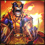
Post by Attitude Adjusted on Feb 17, 2010 5:53:13 GMT -5
The background on the Cravate is a grunge brush.. I'll just keep on practicing.
|
|
|
|
Post by Attitude Adjusted on Feb 17, 2010 8:36:44 GMT -5
I added another one again.
|
|
|
|
Post by Attitude Adjusted on Feb 19, 2010 2:31:51 GMT -5
Added two more so I could have some feedback.  |
|
|
|
Post by Attitude Adjusted on Feb 19, 2010 10:54:27 GMT -5
Added 2 again. Any feedback guys?
|
|
Shaun
Backyarder

Posts: 198
|
Post by Shaun on Feb 19, 2010 11:40:56 GMT -5
Orton ones already been covered, brighten up Orton and remove the effect over him, effect over focal is like putting the cap on a camera over its lens, get me? CM Punk, not too keen, looks over sharpened, and pretty plain, but its a start. The Narutoey dude one is pretty good, background especially. Nice flow, i don't think the render needs blending, looks good to me one of the best out of all these. The flamey thingy one, again, pretty good, but im assuming the dude is the focal point, and he looks way blended with the flames(?), so try and make him stand out more. The Michael Jackson one, as i said in Betrayal thread, is very nice, the re-placement of the stock/ render is very cool. On the left though, MJ looks like hes blending in with the background just abit too much. The two after that don't live up to the majority of the others, the purple one is what looks like a threshold filter, and looks ugly. The hockey dudes background is very blothcy and unappealing, as is the colour scheme. Change the colour scheme on the hockey one, add a low opacity B&W gradient map, fiddle with the background and it'd be better. With the purple one, reduce that filter/ effect, and add some more colourful effects, that are more appealing. Darth Mol one is really nice, just try and bring him out a little around the face, fiddle with brightness and contrast or duplicate the render and put it on on hard light and mess around with opacity. Overall, majority is nice work, keep it up  |
|
|
|
Post by Attitude Adjusted on Feb 19, 2010 12:28:32 GMT -5
The purple one is a quick job and as you said is just a threshold filter. lol
|
|
|
|
Post by H Y T M A N on Feb 19, 2010 15:38:51 GMT -5
You shouldn't really use threshold filters, if you want that effect, just use a gradient map. Everything will loook alot smoother and more effective. I'd say the Michael Jackson one would be your best so far, except the text needs to be moved closer to the focal. Keep it up bro, you're getting better though |
|
|
|
Post by Attitude Adjusted on Feb 20, 2010 3:02:01 GMT -5
Thanks Jake.  |
|
|
|
Post by Attitude Adjusted on Feb 20, 2010 7:44:48 GMT -5
Added a couple more.
|
|
|
|
Post by H Y T M A N on Feb 20, 2010 15:07:00 GMT -5
These are some of your better ones, however one thing that you're lacking is blending. Try filling the canvas a drak grey colour before you start, then paste the stock and set it on lighten. This will blend anything darker than the BG colour into the actual BG and will help blend it. |
|
|
|
Post by TC on Feb 20, 2010 15:40:12 GMT -5
I really like the CM Punk one with the purple/orange theme to it. The effect is pretty cool. But I don't like the border being like that at all.
|
|
|
|
Post by Attitude Adjusted on Feb 21, 2010 9:05:37 GMT -5
I don't know why I love that style of border.  |
|
|
|
Post by waynev1 on Feb 23, 2010 10:56:09 GMT -5
There is some good work in here man! nice job I love some of the brushes and the effects you have used! good choice keep it up i would not mind to see more from you.
|
|
|
|
Post by Attitude Adjusted on Feb 23, 2010 11:18:35 GMT -5
Thanks dude. I appreciate that.
|
|
|
|
Post by Attitude Adjusted on Feb 25, 2010 10:17:03 GMT -5
Added a Creed one. CnC on that please?
|
|