|
|
Post by uksix on Apr 2, 2011 13:13:03 GMT -5
I think it looks good.
|
|
|
|
Post by Hurricane on Apr 3, 2011 0:19:09 GMT -5
Yeah quit spamming you lot, haha.
I quite like it, but I think the blue outline thing is a bit too thick. I'd half its thickness.
|
|
|
|
Post by Diablo. on Apr 3, 2011 0:41:11 GMT -5
Any better?  |
|
|
|
Post by Hurricane on Apr 3, 2011 1:08:19 GMT -5
Left side is thicker than the right. I also think its too blurry for much of it, namely the left side where the orange/blue touch, and the corner outlines. I bit more sharp and crisp, like the right orange/blue touching part would be better.
|
|
|
|
Post by King of Kings on Apr 3, 2011 3:32:49 GMT -5
You're really talented Diablo. One thing I would suggest is remove the outer bevel/blue outline all together. Find another way to bring it all together. Mayb just a solid blue stroke, with no bevel/emboss. The stars have no bevel/emboss on them, and they look great. Go for that look as well on the outline of the entire graphic.
you should put one of the person's micros behind their name, kind of faded into the background, you know that I mean? I think that would also look sick and really improve it
|
|
|
|
Post by Diablo. on Apr 3, 2011 3:38:16 GMT -5
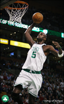
you should put one of the person's micros behind their name, kind of faded into the background, you know that I mean? I think that would also look sick and really improve it I used to do that when I made cards for MWE, and I intend on doing so with these Example:  And I agree with the blue border, I'm thinking of having it as plain baby blue and about 2px wide. |
|
|
|
Post by King of Kings on Apr 3, 2011 3:39:47 GMT -5
Yeah like that. You've got the right idea.
|
|
|
|
Post by Hurricane on Apr 3, 2011 3:55:32 GMT -5
More faded than that, but yeah.
|
|