|
|
Post by Diablo. on Apr 23, 2011 4:07:59 GMT -5
 Match One Match OneMS Non Wrestling Championship Tournament Match MJH vs. Jake666 Stip: Any movie antagonistMJH:  Jake666: 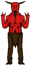 Match Two Match TwoMS Non Wrestling Championship Tournament Match AC vs. Dave Stip: Any robotic/cyborg characterAC: 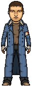 Dave: 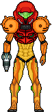 Match Three Match ThreeMS Non Wrestling Championship Tournament Match Haasamaniac vs. SPZ Stip: Any fighting game characterHaasamaniac: 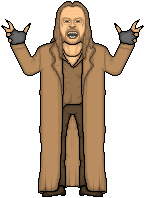 SPZ:  The winners of these three matches will face off in a triple threat at MS16 for a spot in the Non-Wrestling Championship match at MicroSlam, so get voting, guys! |
|
|
|
Post by Next Generation on Apr 23, 2011 6:32:25 GMT -5
Match 1
MJH v Jake 666
Very good micros from both competitors. MJH i really like this, shaping is great, shading is good and the contrast of colours is very good. Jake also very good shaping, shading isnt bad either but the face needs more improvements.
VOTE: MJH
Match 2
AC v Dave
AC, i like this character, well done on the jacket its very good and the face is also good, it lacks shading in places but in all a very good job. Dave, Good effort with the upper torso and head, im not a fan of the mid section to be honest it looks bland compared to the rest of the micro but shaping is particularly good.
VOTE: AC just
Match 3
Haasamaniac v SPZ
SPZ, good micro but not your best imo, shading is ok the skull is good but as i said not your best nothing stands out in particular. Good effort. Haasmaniac, Great job, good facial resemblance and your style of microing is one of the best on here, jacket is really good too but needs more shading.
VOTE: Haasmaniac
|
|
|
|
Post by Ermolli on Apr 23, 2011 14:00:46 GMT -5
Match 1 - MJH vs Jake MHJ . Both of this micros are really good. Jake, the Tenacious D devil, is a very original choice, as well as a tough thing to make. You pulled it well, the shaping is really good, but theres something that puts me off of it. Shading is also well done, i like the colours you used. But my main problem is the shaping of the head, its kinda circular. Looking at some ref pics, the head should be less wide, and longer. The "pants" are also well done. I got no problems with them. MJH, i personally dont know who he is, but i got to tell you, it looks fantastic. I really like the helmet or mask, as well as all the equipement. It flows perfectly. Really love how you did the shading. I cant give you much feedback as i dont know who he is, but none of the less, i really like it. I find it more attractive than Jakes, so my vote goes to MJH. Match 2 - AC vs Dave Both micros look good. AC made Wright in his human form (without showing any robots parts), i expected to see a robot, or when his face is one part destroyed showing the robot face, but you made him all bones and meat. Looking at ref pics of his face, i dont see much resemblance on it. I do like the "attire". Shading is good. The coat looks good. Nice micro. Dave, that Samus Aran looks good. Shaping is well done for the most parts, shading is also good also. I think you made the abdomen, a bit longer that it should be. Its a tough decison, both micros are good, i keep changing my mind. But i got to go with AC. Match 3 - Hassamaniac vs SPZ Hassamaniac Sorry SPZ, but i didnt have to think it. Jack, i told you already that Sabletooth is really good. I see lots of resemblance and the hair is really well done. The pose is well done, as well as the shaping overall. Whats up with that hands bro?  Shading is ok, although you could have work on it more. Overall its a real good micro. Spz.... you made much better micros than this one imo. Im not liking it much. The skull is well done, but you could improve it more. I dont like the shaping of the jacket, as it look kinda attached to the body. You could improve the shading more. As i said my vote goes to Hassamaniac |
|
|
|
Post by Diablo. on Apr 23, 2011 14:08:38 GMT -5
Guys, this is who everyone made
MJH: Lord Zedd (Power Rangers)
Jake666: Satan (Tenacious D Pick of Destiny)
AC: Marcus from Terminator Salvation
Dave: Samus Aran from Metroid
Haasamaniac: Sabretooth (most X-Men games, I guess)
SPZ: Grimm (Twisted Metal)
|
|
haasamaniac
Backyarder
 MS Cruiserweight Champion
Posts: 196
|
Post by haasamaniac on Apr 23, 2011 14:37:47 GMT -5
Match One
MJH vs. Jake 666
The devil from Tenacious D is an original choice. I think you did a great job of it, the shading and shaping looks great although heads is a bit off like Ermolli said. MJH it looks great. I really like what you did the with the white and green bits. Shaping and shading look spot on. They both look great but I think MJH made the better of the two.
Match Two
AC vs Dave
I really like the attire on ACs but the resemblance isnt great. The shading is really nice though. I also really like Daves but I don't like the shading as much and there is something off about the mid section. It's close but I pick ACs.
|
|
|
|
Post by Diablo. on Apr 23, 2011 16:14:33 GMT -5
Match One: Both of these are terrific micros, both very original concepts. MJH, your Lord Zedd is very crisp, the colours work and overall it flows pretty damn well. Jake666, I love the concept, and the amount of detail you have put in is insane. In saying that, it just seems a tad overdone in terms of the body definition, which drags it down, but the rest is awesome. However, my vote goes to MJH
Match Two:: Two decent micros here. AC, I havent seen anyone make this yet, and I applaud you for the originality. In saying that, the micro just looks very flat and such. Still, not bad. Dave, I see you've put in a bit of anti-aliasing, but overall the shading (and lack of contrast) pulls the micro down. I give my vote to AC, however.
Match Three: Haasamaniac, good job here! I really like the look, the jacket could have probably done with some more creasing, though. SPZ, I like it, the concept is good and the shading isn't bad. But the lack of blending/anti-aliasing and the sub-par shaping brings it down, thus my vote is given to Haasamaniac.
|
|
|
|
Post by Alex on Apr 23, 2011 16:46:48 GMT -5
Match 1
MJH: I like the metal shading a lot, overall shading is very good too. I think the little "z" horn he has should be longer though, also the lower legs are a little too thick. But other than that, no real complaints, it looks great
Jake: The face doesnt look a whole lot like him, he needs a more pronounced "evil" browline, and he's missing some facial hair and pointy ears. The anatomy isnt bad save for the chest being waay too long. Also try thinning out the wrists a little more. Other than that the pose is good and the furry legs are very well done. I like that your challenging yourself though, this looks like a tough one
Vote: MJH
Match 2
Dave: Its not bad, but the shading in some areas is very lacking. You have 3-4 shades in some areas yet there's still very little depth to the shading, the orange and yellow parts especialy. Not saying use more shades, but contrast your current shades more. Also some parts, namely the shoulder, desperately need AA.
AC: I like the face and hair quite a bit. The jacket's good too but the arms look much too skinny compared to the width of the torso and legs.
Vote: AC
Match 3
Haasamaniac: The face is very well done, though the shading is a little low contrast. But great resemblance. I would also make the coat a little less wide on each side. But overall the pose is well done, i like it a lot
Spz: Shading on the clothes is still a bit messy but its an improvement. I dont like the pockets on the vest though they dont flow well with the rest of it.
Vote: Haasamaniac
|
|
|
|
Post by MJH on Apr 24, 2011 15:51:55 GMT -5
AC - overall I prefer this, although I'm not too keen on the coat shading the rest is clean and looks good, Dave's is ok but it just seems messy and the shading is lacking.
Haasmaniac - I think the shading could be a bit better but overall the pose and idea is pretty good, spz's is ok but the shaping is messy in parts and the shading of the jacket is horrible. Also I don't think he should've left the bg blue.
|
|
|
|
Post by Hurricane on Apr 24, 2011 20:36:46 GMT -5
MJH - Both are very original, but Jake's just looks weird without ears. I LOVE the metal shading on MJH's and overall its just very crisp.
AC - Dave, you done pretty well on this, but it needs to be shiny, since its metal. You shaded it really lightly (pretty close together shades), when they should be high contrast for metal.
Haasamaniac - SPZ, you done alright and it is a bit of an improvement, but it still seems rushed. You could have spent another hour working on shading, pose, whatever to make it stand out a bit more. Haasa, I'm not a fan of the shading, its very basic and flat, but its VERY original and the pose/doing things from scratch is impressive.
|
|
|
|
Post by CMC on Apr 24, 2011 21:37:08 GMT -5
MJH v Jake 666
Both are pretty awesome. I love the idea of yours Jake, I just don't think it's been executed perfectly, where as MJH's has.
VOTE: MJH
AC v Dave
AC for me. I like how this is made, and that you didn't use your cartoony temp. I'm growing bored of it, and it's fun to see a micro like this from you. Dave, it looks okay, but this has been done by a few people recently, and yours just isn't as good as some we've seen.
VOTE: AC
Haasamaniac v SPZ
Going for Haasamaniac. It baffles me how Spz has been doing them so long, and still isn't giving off huge improvements. Still. Great pose from Haas.
VOTE: Haasmaniac
|
|
|
|
Post by Diablo. on Apr 24, 2011 23:16:50 GMT -5
MJH def. Jake666 7-0
AC def. Dave 8-0
Haasamaniac def. SPZ 7-0
MJH, AC and Haasamaniac will face off at MS16 in a Triple Threat Match, where the winner will go on to MicroSlam in a match for the Non Wrestling Championship.
|
|
|
|
Post by the rising underdog on Apr 24, 2011 23:58:48 GMT -5
wooo is there a title for most matches lost lol
|
|
|
|
Post by Diablo. on Apr 25, 2011 0:18:41 GMT -5
Yes, and I hold it.
|
|
|
|
Post by the rising underdog on Apr 25, 2011 11:29:54 GMT -5
lol no dude i should be the one who holds it i never won a single match on this forum
|
|
|
|
Post by Diablo. on Apr 25, 2011 12:05:57 GMT -5
lol no dude i should be the one who holds it i never won a single match on this forum I've lost 12. |
|


 Shading is ok, although you could have work on it more. Overall its a real good micro.