|
|
Post by Hurricane on Jul 11, 2011 22:52:32 GMT -5
 Champion vs. Champion: Non-Title Match Champion vs. Champion: Non-Title MatchErmolli vs. Haasamaniac Stips: Freestyle Ermolli:  Haasamaniac: 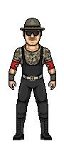 Number One Contenders: Number One Contenders:Dave vs. Next Generation vs. SPZ Stips: Any superhero/supervillain. Dave: 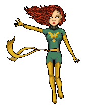 Next Generation:  SPZ:  Get to votin', ya'll! |
|
|
|
Post by SPZilla on Jul 11, 2011 23:00:43 GMT -5
Ermolli vs. Haasamaniac
this is a tough one....the Flavor Flav is great but so is Slaughter...im gonna go with Haas. here because the camo is great!
vote: Haas.
|
|
|
|
Post by Hurricane on Jul 11, 2011 23:27:32 GMT -5
Not sure who you made Ermolli, as I don't know who Flava Flav or whoever is. VERY original and I love the upper half. I think the yellow shirt is a bit flat, and the legs are a bit odd. I know you went for the walking pose, but it doesn't come across as well on paint, and just looks like a shorter leg, and I'm not a huge fan of the pants' shading. Great work with originality, though. Haas, you done great. It's less adventurous than Ermolli's, but you nailed it. Camo is fantastic.
My vote: Haas
Dave, great work overall. Hair is a totally different style to the rest, which is odd, but its much better than the template hair from before. Pose is good and shading isn't bad. Next Gen, I know this is an old micro and that you didn't have time to make a new one, so it doesn't reflect where you're at now. It's not good, at all, though. SPZ, not bad, but very simple and basic. Face looks weird and the boots should curve like the belt/yellow on elbow.
My vote: Dave
|
|
|
|
Post by Diablo. on Jul 12, 2011 0:01:41 GMT -5
Match One: Haasamaniac gets my vote. Two very good micros, however, the shading on the pants with Ermolli's micro, despite being a terrific concept, doesn't seem well executed, especially on the right leg. Haasa's micro, however, is essentially flawless for what it is, thus he gets my vote.
Match Two: Dave scores my vote here. Very original micro, very original pose, and despite some colouring and minor shading issues, runs rings around the other two micros. Next Gen... I struggle to find positives to say about the micro other than nice try, considering the time you whipped this up in, and I applaud you for handing in rather than no-showing. SPZ, not bad, but the shades of red and yellow you chose... ick, they seem pretty... dirty? I don't know the right term to describe it really, they just seem poor.
(Also, Cane, I personally think Dave should be getting a title match for like the NWCW title down the track soon, he is on a role.)
|
|
|
|
Post by Hurricane on Jul 12, 2011 0:16:15 GMT -5
He should get a title shot? Are you serious, bro? The match you just voted on is a Number One Contender's match, and hes two votes up...?
|
|
|
|
Post by Diablo. on Jul 12, 2011 0:57:49 GMT -5
He should get a title shot? Are you serious, bro? The match you just voted on is a Number One Contender's match, and hes two votes up...? My bad, I didn't see it was a Number One contenders match. :\ |
|
|
|
Post by the rising underdog on Jul 12, 2011 1:49:40 GMT -5
diablo thanks for those really kind words  it nice to know i made a mark |
|
|
|
Post by Next Generation on Jul 12, 2011 2:19:53 GMT -5
Ermolli v Haasamaniac You guys should be proud of the micros you are making. I remember a month or 2 back it was when we were betting on who would be the first out of us 3 to win a title on here, Bastards just had to win titles didnt you  . Love the matchup here kudos to Cane for making it. Ermolli, Great micro man, shaping is really good all round and the pose is probably the best part about the micro. Shading has let you down a bit here though, its just a bit flat. Haas, your really showing your talent, Shading is spot on, The camo is really good. Hard to pick a winner tbh but. VOTE: Haasamaniac, the camo got my vote |
|
haasamaniac
Backyarder
 MS Cruiserweight Champion
Posts: 196
|
Post by haasamaniac on Jul 12, 2011 15:15:22 GMT -5
Dave vs. Next Generation vs. SPZ
Dave, I really like this micro you pretty much nailed the pose. Next Generation, like Cane said it's an old micro and doesn't show what you can do at the moment. SPZ, I like it. I'm not fan of the face but the rest of it seems solid.
My Vote: Dave
|
|
|
|
Post by Alex on Jul 12, 2011 21:16:01 GMT -5
Champ vs Champ
Ermoli: I really like it, you captured him very well. Some of the shading could use better blending but overall the shading is pretty good. Pose looks great, the walking stance is very hard to pull off right without looking weird but you nailed it
Haas: I like the camo work a lot as well as the head but the rest, by comparison is a bit generic-looking, though it is well shaded.
Vote: Ermoli
Number One Contender
Dave: Hair looks a bit weird, its not bad but like Cane said the style differs from the rest. The rest is pretty good and the floating-pose is well done. I also like the pheonix symbol on the chest
NG: Face isnt bad but the body isnt very good. The arms look a bit goofy and his shoulders should be built up more. Legs are also too small but the shading on the pants is quite good.
Spz: Not awful but a lot of it looks messy. The red shading is a bit too high-contrast. Also the boots flattening straight-across at the top just looks weird.
vote: Dave
|
|
|
|
Post by SPZilla on Jul 12, 2011 21:59:44 GMT -5
Champ vs ChampErmoli: I really like it, you captured him very well. Some of the shading could use better blending but overall the shading is pretty good. Pose looks great, the walking stance is very hard to pull off right without looking weird but you nailed it Haas: I like the camo work a lot as well as the head but the rest, by comparison is a bit generic-looking, though it is well shaded. Vote: Ermoli Number One ContenderDave: Hair looks a bit weird, its not bad but like Cane said the style differs from the rest. The rest is pretty good and the floating-pose is well done. I also like the pheonix symbol on the chest NG: Face isnt bad but the body isnt very good. The arms look a bit goofy and his shoulders should be built up more. Legs are also too small but the shading on the pants is quite good. Spz: Not awful but a lot of it looks messy. The red shading is a bit too high-contrast. Also the boots flattening straight-across at the top just looks weird. vote: Dave im pretty sure it was a templete... just saying |
|
|
|
Post by Hurricane on Jul 12, 2011 23:43:09 GMT -5
actually, I think it's a templ ate, just saying.  |
|
|
|
Post by the rising underdog on Jul 12, 2011 23:58:12 GMT -5
lol
|
|
haasamaniac
Backyarder
MS Cruiserweight Champion
Posts: 196
|
Post by haasamaniac on Jul 14, 2011 22:46:14 GMT -5
Is this still going?
|
|
|
|
Post by AC on Jul 14, 2011 23:00:22 GMT -5
Ermolli vs. Haasamaniac
Going with Haasamaniac. His shading is better.
Dave vs. Next Generation vs. SPZ
Going with Dave. His is the best of the 3.
|
|


 it nice to know i made a mark
 . Love the matchup here kudos to Cane for making it.