|
|
Post by CMC on Jul 3, 2010 20:21:28 GMT -5
 Show 2 Card posted in MXT board! Rookie/Pro Tag Team Match:CMC and Attitude Adjusted vs. Gavscsa and eMasson CMC and Attitude Adjusted  Gavscsa and eMasson  Prize: Prize: 3 Points Rookie vs. Rookie vs. Rookie:Famous vs. Jake_666 vs. Keff Famous  Jake_666  Prize: Prize: 3 Points Keff  Prize: Prize: 3 Points Pro vs. Pro:MJH vs. Alex MJH  Alex 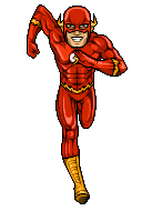 Prize: Prize: 2 Points Open Challenge Match:Jake_666 vs. eMasson vs. Keff Vs. CMC Vs. Attitude Adjusted Vs Famous Jake_666  eMasson  Keff  CMC  Attitude Adjusted 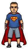 Famous  Prize: Prize: 2 Points Vote on micro matches AND bonus points. Best Micro
Biggest Improvement
Most OriginalTheres the first show. Vote away. |
|
fool
Newbie

Posts: 25
|
Post by fool on Jul 3, 2010 21:41:08 GMT -5
Rookie/Pro Tag Team Match: Its apparent that CMC and Attitude Adjusted have the better microes here. Gav's micro is pretty solid, but alot of the detail gets lost upon viewing it without zoom. eMasson's temp needs work and a lot of the micro gets lost in the dark tones and ends up looking two toned shaded. CMC's micro is solid; however, it is a little bare. If it wasn't for the superior shading I wouldn't vote this way cuz these wrestlers, on average, barely wear any clothes which makes a lot of the micro just a temp. Be that as it may, the hand wraps are done well and the pattern on his pants are nice (though they do look totally flat). The face is done nicely but the neck is unrealistically square. Attitude Adjusted uses too similar of a temp (you might want to change that up in the future when your teaming up as no two dudes have the same looking body). The facial hair and shoes are nice, the mask is like CMC's leg patterns (looks flat also), and I think that the pants may just be altered temp work. Also, CMC's avy is pissing me off because he forgot to delete the background under the arms.....but thats not here nor there. Simply because of the superior shading, I am going to go with CMc and Attitude Adjusted. Rookie vs Rookie vs Rookie: Famous: your temp is overshaded, head looks funny, other stuff is way too flat; though I think the shoes would have been cool if you didnt just leave that space blank on them. Keff: The face is a little too wide but it is well shaded. The rest of the temp is pretty bad ESPECIALLY the hands (no offense). Consider this: the thumbs are smaller then the temp's nipples. If you did make the temp from scratch, hats off but it needs work. The rest of the clothing, if you can call it that, it ver flat. Also, the legs look like an action figure (in that they dont look like they are really connected to the body). Jake_666: Good work, finally we get some clothing. The shorts are very well done. Without zooming in, the white lines on the pants make it look like its missing pixels. I know its a narrow space, but you might want to consider loosing some of the black outline on these types of space so that you have more room to shade in these tight spaces (wow, run on sentence for the win!) The black shirt is way too black. I can't even make out any of the creases. I think you may have done that on purpose or out of laziness, but unless this shirt is skin tight (which would be hard to do on something sleeveless and not above the neckline) you would see creases in this. Pattern on the shirt is done well and it doesnt look well. The hat could use some more reverse shading as could the boots (i cant make out any detail on the boots). The temp is over shaded and the arm stuff could use some work (maybe its just the scheme on that black) but it doesnt *pop*. Gloves have a lot of detail in a small space and come out flatish (not totally flat). Same shit of the white on the pants goes for the gloves. Your temp looks too temp like though its well shaded. Best part is the face and EXPRESSION (woot!). Good job. My vote goes for you. Pro vs. Pro It must suck to be MJH. He makes really great microes, but (i assume) loses to Alex every time. My only critique on MJH is that the face is too blocky and doesnt really look like Anakin (at all really). Other wise its a great micro, great dither and saber (thats posibbly the best saber effect i have ever seen. The best part are the rocks in my opinion. Great job. Your still going to lose though.  Alex. Perfection. Muscles and anatomy is great. The shading is bar none, the best. Highlights are amazing and it makes it look like the material it is supposed to be out of. Pespective (especially on the foot taking off the ground) is amazing (same with the open hand. However, Wally has green eyes and Barry has blue eyes. Neither has grey eyes. Fix that shit. My vote goes for Alex (sorry MJH). Open Challenge Okay, way too many entries to critique individually. CMC won this because his micro has the best and cleanest shading. he also has the most detailed face. The pants are great and the boots are very bootish. You get my vote. Best Micro: Alex (again, sorry MJH). Biggest Improvement: Wouldn't know. Most Original: Either MJH for the saber and rocks or Alex for the pose. Hmmm, Ill go with MJH because I've seen way too many superhero microes (though I have also seen a lot of star wars microes too). |
|
|
|
Post by Alex on Jul 3, 2010 21:54:45 GMT -5
Gonna start writing up my votes, hopefully have em in by tonight
|
|
|
|
Post by CMC on Jul 3, 2010 22:13:52 GMT -5
Good luck to all of you guys in the tag match. Some great micros.
Rookie vs. Rookie vs. Rookie:
Famous vs. Jake_666 vs. Keff
3 Decent micros here. Famous, I like how it's come off, but I HATE that template. The face holds a tiny bit of resemblance, but could look more intense like Low Ki normally does. Attire looks a bit flat, and the white could do with some AA. Great job on the Miz Jake. Easily one of your best IMO. Shading looks pretty good. A little resemblance, however I feel the jawline is a bit to strong for Miz. Not bad Keff, but IMO, the weakest of the three. Did you ask for help off of MJH, because I'm not sure how much contact you guys have, but he'd be able to help a lot when it comes down to shaping. Hand shaping is pretty terrible, and the micro as a whole is only solid. Nothing mind blowing from this.
Vote: Jake_666
Pro vs. Pro:
MJH vs. Alex
Wow. Both amazing micros here, but it has to be Alex for me. MJH, a great micro. Resemblance is nice, shading is brilliant, and the glare on that light saber is superb. But then I look at Alex's. Amazing micro. I love how hes managed to make such an intricate pose, yet still keep it looking like a micro, rather than pixel art. Shading is fantastic, and the shine on his costume is beautiful.
Vote: Alex
Good luck to those in the OC.
Best Micro: Alex
Biggest Improvement: Jake_666
Most Original: Alex
Thanks for the great turnout and making my first MXT show an easy one guys!
|
|
|
|
Post by Hurricane on Jul 3, 2010 23:56:08 GMT -5
Great effort guys, too tedious to vote from this ipod with shitty connection.
|
|
|
|
Post by Alex on Jul 4, 2010 0:45:55 GMT -5
Tag Match
CMC & AA: I really love the detail in Bourne’s attire, the designs look perfect. I like the temp a lot, muscle definition seems appropriate for him, although the head looks a little generic, most Bourne micros with good resemblance tend to give him that toothy smile, might work on this. Rey looks good as well, but should be a little shorter. The attire looks a little plain for rey, but the attire features some pretty good shading. Overall its very good quality-wise but could pop a little more, if you updated with his tats for instance would give it that extra something.
Gav and eMasson: Morisson looks very good, although im not too crazy about the head, something about the sides of the mouth looks odd. The attire is where it shines though, theres a lot of great detail in there which can be hard to see cuz of the brightness of it. It has a really cool texture to it, and brings the designs out really nicely. One thing I noticed is the chest is really long, making the torso look as long as the legs. Emasson, I like that you have your own style already and Im guessing do things from scratch? However I think this also suffers from a case of huge torso. Maybe bring the shoulders in a bit. Also like Kenny said its tough to see the contrast in the shades, from far away it looks like its 2 shades, also some highlights in the pants would really help.
Vote: CMC and AA
Triple Threat
Famous: Im not too current on wrestling these days so I don’t really know who this is, but the face still strikes me as generic. The elbow pads look a bit too high up, and the attire looks like it lacks shading, try darkening and contrasting the shading you use, especially on the white. Its not bad overall just doesn’t doesn’t stand out as something that will be remembered
Jake: Very impressed at how this came along compared to how it started. I think the resemblance turned out very well and you did a good job on the attire and designs, although some of red parts could be blended into the grey a bit more. The shirt version was a nice touch and the image on it looks great, though the creases could be brought out a bit more.
Keff: Again don’t know who it is but I like the head as far as shading goes, the stubble looks really good. Besides the hands, the shaping is good on the arms and the pose is, for the most part, well done, but the shading and shaping on the eblow pads looks off. The rest of the attire looks good, but some highlights could make the kneepads and boots standout more
Vote: Jake
Pro vs Pro
Good luck MJH, very cool effects with the rocks and the clothes’ shading looks great
Open Challenge
It’s a little hard to tell how well the attires have been changed, but ill take my best shot at judging the designs.
Jake: Looks good but I think it could have gone further with the Kane theme, like incorporated the mask design in the face paint, and doing something with the pants
EMasson: It’s a good attire and the shirt is well done but I think you coulda had a bit more fun with it by doing some sort of theme like some of the others
Keff: Again, nice theme, but still a little basic, mostly just red w/ white flag, or white w/ red flag.
CMC: Very imaginative theme, almost went over my head. I really like how the tights design still looks like something the Guns would wear yet retains the Iron Man theme
AA: Very fitting theme for super Cena, lol. Although the shirt looks oversized to my understanding you couldn’t change the original micro, so I wont hold that against you, and the addition of the cape works very well.
Famous: Another clever theme, I think the flame designs look really good, but because you don’t have much attire to work in the designs, it doesn’t go as far as it could have, but you made the most of it, and I like the addition of a mask and strands from the arms
Vote: CMC
Best Micro: MJH’s Anakin
Most Improved: Jake666
Most Original: CMC’s Shelley
|
|
|
|
Post by Famous. on Jul 4, 2010 9:19:42 GMT -5
lol at all the hate for Cobra's temp, I have stopped using that now, I have started to make my own, as you can see in my most recent MWE micros, (on caws.)
Thanks for the CNC though guys, and I will post my votes soon.
|
|
Saul
Backyarder
MS Tag Champion
Posts: 145
|
Post by Saul on Jul 4, 2010 14:15:46 GMT -5
lol at all the hate for Cobra's temp, I have stopped using that now, I have started to make my own, as you can see in my most recent MWE micros, (on caws.) You should have stopped using it when I stopped >_> I'll vote later. |
|
|
|
Post by Alex on Jul 4, 2010 18:06:00 GMT -5
bump
|
|
|
|
Post by CMC on Jul 4, 2010 20:02:34 GMT -5
Come on guys. Vote!
|
|
|
|
Post by Hurricane on Jul 4, 2010 21:35:49 GMT -5
Tag Match:
Good micro CMC. Attire/etc are fantastic, but head is generic. Not sure about Attitude using your template, because I dont think he is in a position where he can accurately copy your style. Would be better if he fleshed out his own style. Also, why does AA's Rey have no tattoos? Good micros overall.
Gavscsa, not bad at all. I can tell you put a lot of effort in. The new style is a lot better, but shading could still use a bit of work, and the head resembles a mad scientist. Solid attempt, however. R-Truth is cool. Very original style. Upper body is way too big. Designs and face are pretty good, though.
My vote: Gav/eMasson
Three Way:
Famous, not bad, but also pretty damn generic. Not really stepping up here, or making things we havent seen before. Try to step up and stand out.
Jake, my man, excellent micro. I can see Alex has been helping on the face, and it looks great. Try to get some pointers as to a new template, because that one isnt amazing.
Keff, I appreciate the effort and the pose and whatnot. Im not entirely sure as to who it is? Dibiase? Orton? Head isnt great, and the torso could be a little bit bigger.
My vote: Jake
Pro vs. Pro:
Amazing, MJH. Just like Luke, I hate the straight vertical lines going down his cheek, but apart from that, its phenomenal. Excellent shading, rocks/sabre were a good touch.
Alex, VERY well done, but I prefer greatly which the poses are more basic and microish. I can understand arm poses, or something else, but this just seems like a comic book pixel art. Very good though.
My vote: MJH
ill vote on rest later probably... tired as shit..
|
|
The Triple-Six
Amateur
C'est La Vie, Adios, Good Riddance, Fuck You!
Posts: 462 
|
Post by The Triple-Six on Jul 4, 2010 22:11:14 GMT -5
Tag Match
Team 1:
CMC - Fucking epic! Face, attire, body, everything is amazing. All I can say is that maybe the armbands are a little dark but that was probably on purpose.
AA - Very creative and amazing attire. Body def. looks like his and I can see resemblance even through the mask. But only one thing, where the fuck are his tattoos? lol
Team 2:
Gav - I think it's good, but I think the hair could use some work. The head is also an issue, small. But that's just your style. The body and attire makes up for it though. Naice
Emasson - Ugh, sorry man. I'm not a fan of this. Huge torso and head. I can only see likt two shades in the attire and body. The shaping of the pant is good and the design is awesome. Face looks weird. Pretty decent all in all.
VOTE:: CMC and Attitude Adjusted
Triple Threat
Good luck guys, and great jobs ;D
Pro vs Pro
MJH - You have blown my fucking mind with this one. Excellent shading, resemblance, effects, everything. And no High Heels! XD
Alex - Same exact thing as above, except for one thing; Your's just seems more unique. There's motion involved and it just pops. Along with the fact it's perfect.
VOTE:: Tough, but I have to go with my man Alex.
Open Challenge
Can't vote, good luck all!
Best Micro: Alex's Flash
Most Improved: Attitude Adjusted
Most Original: CMC’s Shelley |
|
AVCore
Backyarder
MS Cruiserweight Champion
Posts: 245
|
Post by AVCore on Jul 4, 2010 23:09:55 GMT -5
Rookie/Pro Tag Team Match:
CMC and Attitude Adjusted vs. Gavscsa and eMasson
I really like that Bourne except for the face which Im not too big on.
Rey looks really good too but I dont think the torso suits him and the fact you left out tattoos looks lazy to me.
Morrison is pretty cool,Truth is decent but proportions are kinda fucked,nose is huge too,but I can see a bit of resemblance.
Vote CMC and AA
Rookie vs. Rookie vs. Rookie:
Famous vs. Jake_666 vs. Keff
Kaval is not too bad but face is very bland imo.
I really like that Miz,face is really good,attire also.
The head on McGillicutty looks a little weird but also looks like him,I think legs look a bit bulky though.
Vote Jake_666
Pro vs. Pro:
MJH vs. Alex
MJH's is great,dont really like some of the face detail but everything else is done well.
Alex's is just amazing,Ive never seen anything like this before,its perfect imo.
Vote Alex
Open Challenge Match:
Jake_666 vs. eMasson vs. Keff Vs. CMC Vs. Attitude Adjusted Vs Famous
CMC's was the best micro to begin with and his custom attire is best of the lot too,just the most well designed and most creative imo.
Vote CMC
Best Micro: Alex
Biggest Improvement: Jake
Most Original: Alex
|
|
|
|
Post by MJH on Jul 5, 2010 8:15:04 GMT -5
I like both CMC and AA's micros, a bit generic in the face but meh that doesn't matter too much, the designs on Bourne are amazing and although the shading of the pants on Mysterio could be better they're still very good.not really a fan of either of Gavs or Emassons, Gavsca's seems quite flat and, forgive the rudeness, childish. emasson's seems completely out of proportion, the torso is massive compared to the legs, not a fan really.
vote: CMC/AA
I like both the face on Keff's and Jake's but Famous's seems a bit generic. Overall I think the best one is Jake's because the attire is very good too.
vote: Jake
OC
I like them all but CMC's particularly stands out, I think it has the best shading and possibly the best idea for an original attire.
vote: CMC
Best Micro: CMC's Bourne
Biggest Improvement: Jake
Most Original: Alex
|
|
|
|
Post by Attitude Adjusted on Jul 5, 2010 9:31:28 GMT -5
Just to clear it out, I didn't leave off his tattoos on purpose because I was being lazy. I just forgot to add them. xD
|
|