|
|
Post by andrew on Aug 24, 2011 21:20:46 GMT -5
So I guess this really is not a WIP but to be honest I do not like how it turned out, maybe it is just me but I feel like I messed up on the shading on the tail, any opinions you guys have on this would be great. 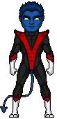 thanks everyone  |
|
|
|
Post by Hurricane on Aug 25, 2011 6:12:53 GMT -5
Looks good to me. Only two suggestions. First is the shading on the white. Try not to overdo it, or have the shades too close together. White is the hardest colour to shade, in my opinion, without making the clothes seem grey or blurry. The gloves/boots look a bit blurry> The other tip, which I have shown in an edit below. Around the outsides of areas, such as the red V thing going down his torso, try to have it darker so it blends more. I circled your version and fixed it on the flipped side.  Hope it helps some. Good work though, nice to see more superhero micros here. |
|
|
|
Post by Next Generation on Aug 25, 2011 10:59:50 GMT -5
green circle of death Ba Bum.
Good micro, like the face alot its got good detail, the attire is shaded well and i think Josh has nailed it there with the advice.
|
|
|
|
Post by andrew on Aug 25, 2011 12:11:55 GMT -5
Thanks for the help everyone, I took hurricanes shading idea with the white and red for the new one and dave helped me out making it look smooth instead of lumpy. 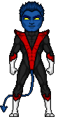 / 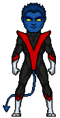 OLD/NEW credits-hurricane/dave I figure that the new one looks better because the red v should not be skin tight so thanks for the help everyone. |
|
|
|
Post by Alex on Aug 25, 2011 13:31:50 GMT -5
I figure that the new one looks better because the red v should not be skin tight so thanks for the help everyone. Its true that it wouldnt show through but it still tends to look plain when you just have a completely flat surface on a micro, i would still try showing some of the contours of the body through the red piece, i would make an edit to show but i dont have a mouse for this computer The rest looks very good so far, i like the classic style a lot |
|
|
|
Post by andrew on Aug 26, 2011 0:09:12 GMT -5
To tell you the truth I was thinking that the red is missing something lol
I'll have the updated version on later today.
Thanks.
|
|
|
|
Post by Next Generation on Aug 26, 2011 1:43:48 GMT -5
Yeah it does still look a tad flat man but keep trying
|
|
|
|
Post by andrew on Aug 26, 2011 9:34:43 GMT -5
okay here we go, Just some little edits so I hope you guys like it 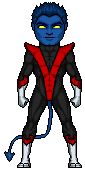 If there is anything I need to change just let me know but I feel pretty good about this one. |
|
|
|
Post by Alex on Aug 26, 2011 13:06:56 GMT -5
yea thats a good balance, looks very good dude
|
|
|
|
Post by andrew on Aug 26, 2011 13:24:37 GMT -5
Thanks glad you like it
|
|
|
|
Post by Ermolli on Aug 26, 2011 13:35:04 GMT -5
I really like it, good work Andrew
|
|
|
|
Post by andrew on Aug 27, 2011 13:26:49 GMT -5
Thanks, means a lot
|
|