|
|
Post by AC on Nov 29, 2011 1:23:13 GMT -5
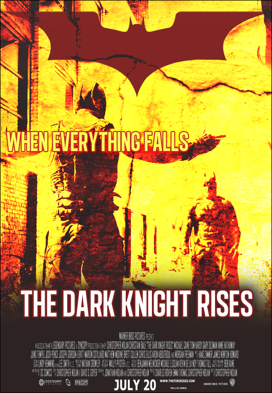 Was gonna go with the traditional black background but it was so boring looking on the first version |
|
|
|
Post by Diablo. on Nov 29, 2011 3:18:08 GMT -5
It's good, but the design (not the work itself, but the design of the poster) looks... amateurish? Like, it wouldn't be seen as an actual film poster, I guess. But still, looks really cool, however maybe a bit too contrasting?
|
|


