|
|
Post by AC on Jan 1, 2012 18:36:16 GMT -5
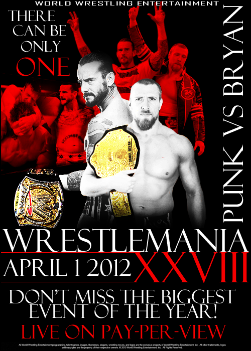 This was kind of an experiment, not sure how much I like it though |
|
|
|
Post by Diablo. on Jan 1, 2012 23:33:22 GMT -5
I love the format and style, but the execution comes off not so well. It's good, but it lacks the professionalism of WWE posters in terms of texture and typeface.
|
|
|
|
Post by Next Generation on Jan 2, 2012 7:11:05 GMT -5
Its good, the colours are nice but it couldve looked a bit better if you had a front on CM Punk and probably a different font. I do however like the background alot so good work
|
|
|
|
Post by Hurricane on Jan 2, 2012 8:17:42 GMT -5
Don't like this one at all sorry. It doesnt have the wow factor that a Wrestlemania poster should have. It seems kind of thrown together, theres WAY too much writing that prevents there from being a main focal point, instead leaving me confused. I don't like the logo either. Sorry to be harsh..
|
|
|
|
Post by AC on Jan 2, 2012 15:10:45 GMT -5
Yeah I don't care for it either
|
|
|
|
Post by Hurricane on Jan 3, 2012 2:34:11 GMT -5
I think lighter colours such as the blue/yellow/white/red scheme they usually have variations of work well, the logo should be bolder and less writing as I said. I'd love to see more ideas and versions of this poster to see how you can make it better.
|
|
|
|
Post by AC on Jan 3, 2012 22:57:18 GMT -5
I'll probably make a more colorful version, this was actually inspired by a UFC poster I saw
|
|


