|
|
Post by AC on Jan 15, 2012 3:22:39 GMT -5
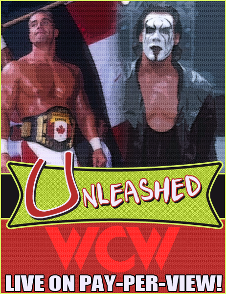 Made for my WCW Diary |
|
|
|
Post by Diablo. on Jan 15, 2012 4:15:44 GMT -5
Simplistic, cool design. Not bad.  |
|
|
|
Post by Hurricane on Jan 15, 2012 6:02:21 GMT -5
Not bad, but just too open and lacking in focals for me. The logo is good, but I think the WCW logo shouldn't be in the background faded in, but rather in the foreground above the logo. I'd then maybe use the red area are the bottom to list a few of the main event matches, or something. Finally, I'd spice up the Storm/Sting area by having a slogan at the top saying something. "Prepare for the ride of your life" or something similar (shitty example). Not bad at all though.
|
|


