|
|
Post by AC on Mar 1, 2012 19:22:24 GMT -5
|
|
|
|
Post by Diablo. on Mar 1, 2012 20:28:46 GMT -5
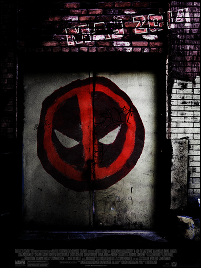
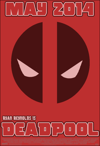
I love the first one as a grungy, 21st century superhero film, which is what I assume is what the poster is for. I do love the second one, as an 80's or 90's film poster, but both look awesome.
|
|
|
|
Post by AC on Mar 1, 2012 21:05:09 GMT -5
Thanks broski. I really like how the first one turned out, it's exactly how I pictured it in my head before starting it.
|
|
|
|
Post by Ermolli on Mar 1, 2012 21:19:51 GMT -5
I didnt realize you've made both of this until i read your comment, cause i didnt realize it was in the "other artwork" topic, and i thought they were real and official-
Anyways, i like both, but i prefer the first one more. The only thing that im not liking very much is the "coloured bricks" with the may 2014.
I also like the second one, as its very simple yet effective as a movie poster. The only thing i dont like about it is that the bottom text is barely visible.
Great work.
|
|
|
|
Post by Hurricane on Mar 1, 2012 23:13:45 GMT -5
LOVE the first one.
|
|
|
|
Post by Alex on Mar 2, 2012 0:27:44 GMT -5
The first one can definately pass as the real deal, fooled me when i checked the 10 most recent posts lol. very nice work
|
|
|
|
Post by TC on Mar 2, 2012 14:21:42 GMT -5
The first one looks legit. Awesome job on it. The second one is good as well, but the text at the bottom should be darker.
|
|
|
|
Post by AC on Mar 2, 2012 15:19:14 GMT -5
Thanks guys. I'm glad the first one is getting so much praise because I thought it turned out awesome
|
|
|
|
Post by TC on Mar 2, 2012 15:46:41 GMT -5
I'd like to see some more movie posters from you.
|
|