|
|
Post by AC on Oct 27, 2013 17:08:13 GMT -5
|
|
|
|
Post by Next Generation on Oct 27, 2013 22:04:26 GMT -5
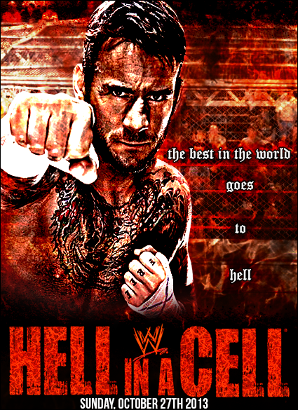
I like it for the most part, i think the letters would look better in caps but other then that it is really nice.
|
|
|
|
Post by Hurricane on Oct 28, 2013 19:35:40 GMT -5
Looks very TNAish haha. I like it, even with the corny slogan haha.
|
|
|
|
Post by TC on Nov 23, 2013 7:46:11 GMT -5
What happened to 'DRUG' on his fingers? Lol.
|
|