|
|
Post by Diablo. on May 5, 2011 3:10:38 GMT -5
 Match One Match OneMS Non-Wrestling Cruiserweight Championship No.1 Contenders Match Jake666 vs. Ermolli Stip: Any cartoon character (e.g. Bart Simpson, Ash Ketchum etc.)Jake666: 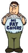 Ermolli:  Match Two Match TwoMS Tag Team Championship No.1 Contenders Match AUSix vs. CMJHC Stip: Any mixed-gender duo (e.g. Batman & Catwoman, Eddie Guerrero & Chyna, Snooki & The Situation etc.)AUSix:  CMJHC:  Match Three Match ThreeMS Cruiserweight Championship No.1 Contender Match Attitude Adjusted vs. Next Generation vs. Haasamaniac Stip: Any wrestling high-flyer (e.g. Kofi Kingston, Rey Mysterio etc.)Attitude Adjusted: 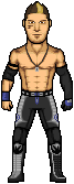 Haasamaniac: 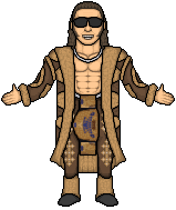 Next Generation:  Deadline: Get voting, lads. Deadline: Get voting, lads. |
|
|
|
Post by Next Generation on May 5, 2011 3:21:06 GMT -5
Hahaha my Evan Bourne is tiny
Match 2
Ausix v CMJHC
Very good micros from all 4 of you, Ausix i like both, yet another Joker made tbh im sick and tired of seing them done but this is very good, the shading can be better on the joker micro but shaping of the jacket, face etc is top quality infact both micros have very good shaping. CMJHC as sson and i knew you guys were teaming i thought unstoppable pretty much and you have proved it, i cant fault both micros maybe shading could be better on the face of the left micro but thats it
VOTE:CMHJC
|
|
haasamaniac
Backyarder
 MS Cruiserweight Champion
Posts: 196
|
Post by haasamaniac on May 5, 2011 3:31:01 GMT -5
Match One
Jake vs Ermolli
I like both but I think Ermolli gets my vote. It was a great idea to make Peter and I laughed when I saw the no fat chicks t-shirt the shaping looks good, shading looks off but that's probably because it's a jpeg. Bender looks good too and I really like the metallic shading and it looks just like him. The pose is good as well.
Match 2
AUSix vs CMJHC
Four awesome micros here. I can't really find anything to complain about. I love the clothing on the Joker and the face looks really good too. Harley Quinn is equally as good and I love the shading. CMJHC, these look amazing. I haven't seen them done before and they look well executed. They're so different and really stand out. It's close but I vote for CMJHC.
|
|
|
|
Post by Diablo. on May 5, 2011 3:41:31 GMT -5
Match One:[/u]
Jake666 - I really like it, a very unique micro. However, I must admit that it looks a little 'rough' overall in terms of the lines and the shading. A good job, though.
Ermolli - I like this, another unique micro. Shaping and resemblence is terrific, but the lack of anti aliasing in places, as well as the perspective (we seem to be looking down on the micro) seem to bring the micro down a bit, but a good job never the less.
Vote goes to Jake666
Match Three:[/u]
AA - Decent Shelly micro, the overall body template looks kind of blurry/messy though. The attire is really nice though, the details are good, and you have got some good resemblence going.
Haasamaniac - Terrific job on this Johnny Nitro. I'll admit, there isn't a part of this that can be called "perfect", but for someone of your experience, it's a great micro. The fur coat and the belt are the best parts of this micro, the legs look awkwardly positioned though.
Next Gen - Nothing overly special, to be honest. The template is quite poor, the facial resemblence is off and there is very little anti-aliasing. Not a bad effort, but I'd have expected better.
Vote goes to Haasamaniac
|
|
|
|
Post by Diablo. on May 5, 2011 5:01:27 GMT -5
For those of you who are wondering, CMC and MJH made a Spitter and Smoker from Left 4 Dead.   |
|
|
|
Post by Attitude Adjusted on May 6, 2011 1:36:43 GMT -5
Match 2
All topnotch micros from the 4 of you. AUSix's entries both have brilliant shading, though the Joker's coat seems a little pillowy(the shading). The facepaint looks too dark imo. CMJHC, terrific job. CMC's micro really pawns and looks awesome. So does MJH's though the face could've been shaded more. Still, they both look awesome.
Vote: CMJHC
|
|
|
|
Post by Diablo. on May 6, 2011 3:02:03 GMT -5
Wow, a terrific turn out from voters...
Anywho, Jake666 vs. Ermolli has been added.
|
|
|
|
Post by Diablo. on May 6, 2011 6:54:32 GMT -5
22 members have been online in the past 24 hours, and we only have four votes...
|
|
|
|
Post by Masson on May 6, 2011 8:48:30 GMT -5
You posted it yesterday, and you didn't even post the whole card. You can't instantly expect 10 or so votes in something that isn't a full show.
Match 1
Main problem I have with both micros is that they look incredibly pillow shaded, and I think the shading is generally messy on both. Both seem to have some shaping issues as well, like in Benders mouth, there should be a lot more curvature, and Peter's belly should 'spill' out from the top of his shirt, and it would make the micro look a lot nicer, imo. I know I'm sounding very negative, but I really don't like either, and I am finding it hard to chose who to vote for.
Ermolli gets my vote.
Match 2
MJH and CMC have made two amazing micros, as have UKsix and Diablo. The only thing to sway my vote is that I don't feel the style of the Jokers head matches that of his body.
Vote goes MJH and CMC
Match 3
Vote goes to AA, it's a solid micro, shows a degree of likeness and the attire is lookin pretty cool. Isses with Haasmaniac is that the whole this is way too low contrast for my liking, it all looks monochrome, and tbh a bit bland. If you had done him in a different, brighter colour (blue perhaps), it could possibly get my vote. NGW, same applies here as what I told you via PM on caws, but it could also do with being a little bigger.
|
|
|
|
Post by TC on May 6, 2011 9:07:40 GMT -5
You posted it yesterday, and you didn't even post the whole card. You can't instantly expect 10 or so votes in something that isn't a full show. I'll be voting later on tonight. |
|
|
|
Post by Hurricane on May 6, 2011 9:41:36 GMT -5
22 members have been online in the past 24 hours, and we only have four votes... Four votes in just over one day, theres nothing wrong with that If you had four votes after 4 days, I'd be annoyed, but one day!? You have to realise with time zone differences and personal non-micro lives, it usually takes 2-3 days for everyone to vote. If after that it gets to the point of The Ultimate Microer, then yeah, feel free to get annoyed, And as Masson said, you didn't even post the full card. This isn't a PPV, you cant expect 10-20 votes for it. I was going to vote tonight, despite me being very sick, but since I typed this instead, voting can wait until tomorrow sometime. |
|
|
|
Post by CMC on May 6, 2011 10:17:27 GMT -5
Match 1Ermolli gets my vote. I just love the look of it. I made a Bender ages back, and this beats my one. I like Jakes, however some of the shading seems strange. Vote: ErmolliMatch 3I think you need to branch away and make your own temp now AA. You're good enough, and mine isn't doing you any favours. I like yours, but it looks too much like my old Shelly. 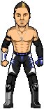 Nice work from the others. Nice Bourne, but it seems too square. Great work on the Nitro. Pose is great. Vote: Haasamaniac
|
|
|
|
Post by Alex on May 6, 2011 15:12:22 GMT -5
Match One
Jake: I think its been saved as a JPG and the colour quality is really smudged. Linework is pretty good though, the pose is well done too but the shading has kind of a dirty look too it.
Ermoli: Really like the metallic look you've given the shading, overall i like it a lot. You captured his expression well and the pose is great. Really impressed with this one. Not sure it really needs the shadow though, i think those are being overused these days
vote: Ermoli
Match Two
AUSix: Really like the work on Joker's outfit, especially the pinstripes on the pants, and the orange part. Face is very good too but it looks like he lacks a neck, or the neck is just too thick. Harley is good too but i also feel the build could be slimmed down a bit, esp. the neck/torso. I like the boots and pants though.
CMJHC: Really like the green slime dripping from the woman's face, and the flabby body is really well done. The tumor looking things on the guy are great, and i like the blood coming off the pants. I do think the two are a little too big though.
Vote: CMJHC
Match Three
AA: Its not bad, but its a bit boring, id also recommend a change of template. Tights look pretty good but the face is a bit generic.
Haas: Very nice work on the coat, i would just contrast the dark brown parts more. Really like the work on the torso that shows. I do think its s little too wide though, try bringing the shoulders in more
NG: tbh im not crazy about this temp, shading looks really flat around the neck/shoulders. the face isnt bad, and i like the tights though they look flat in some areas too
Vote: Haasamaniac
|
|
|
|
Post by Gav on May 6, 2011 16:04:33 GMT -5
Match Ein
Bender stands out more to me. The shading of the shadows have been done well. Peter's interesting too but I would have used more of a pea green pants colour (as he always wears) as they look too faded.
Ermolli.
Match Zwei
Love the Harley but it's just another Joker for me. Not the best looking head on a Joker by a long way either. I think he looks a little too goofy happy, rather than a maniacal happy. Smoker and Spitter are fantastic. Very unique with top levels of detail throughout.
CMJHC.
Match Drei
Even though Morrison's legs look too short (and I'd have them in a wider stance) and the fingers could be more defined (darker shading in between them, shorten the pinky too) it's still the one I prefer. Stands out more than the others as Shelley is another one that has been done in that attire a few times, and Bourne's head is on the small side (and his temp could use some darker shades.)
Haasamaniac.
|
|
|
|
Post by Ermolli on May 6, 2011 16:18:41 GMT -5
Match TwoAUSix: Really like the work on Joker's outfit, especially the pinstripes on the pants, and the orange part. Face is very good too but it looks like he lacks a neck, or the neck is just too thick. Harley is good too but i also feel the build could be slimmed down a bit, esp. the neck/torso. I like the boots and pants though. CMJHC: Really like the green slime dripping from the woman's face, and the flabby body is really well done. The tumor looking things on the guy are great, and i like the blood coming off the pants. I do think the two are a little too big though. Vote: CMJHC Match ThreeAA: Its not bad, but its a bit boring, id also recommend a change of template. Tights look pretty good but the face is a bit generic. Haas: Very nice work on the coat, i would just contrast the dark brown parts more. Really like the work on the torso that shows. I do think its s little too wide though, try bringing the shoulders in more NG: tbh im not crazy about this temp, shading looks really flat around the neck/shoulders. the face isnt bad, and i like the tights though they look flat in some areas too Vote: Haasamaniac Sorry that i had to quote, but what Alex said are my thoughts exactly. |
|