|
|
Post by Attitude Adjusted on Dec 12, 2009 0:40:07 GMT -5
|
|
|
|
Post by Hurricane on Dec 12, 2009 0:58:09 GMT -5
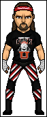
Not bad, but it's a bit flat. Go to the Micro Markdown thread to see the best micros. Notice how they shade and how they make clothes look 3D. It's not a bad micro at all. Attire looks good and I could definitely tell it's him if you didn't say, but at the same time it's not great. Resemblence isn't amazing. Attire, while pretty good, lacks in the shading department. Everything looks flat, especially the tights, headbamd and wrist tape.
Not bad at all man, a good effort. Work harder on shading, get tips and try to modify faces more. Take your time and try to produce your best stuff!
|
|
|
|
Post by Attitude Adjusted on Dec 12, 2009 2:01:49 GMT -5
Where's that Micro Markdown? And where could I shade more?
|
|
|
|
Post by Hurricane on Dec 12, 2009 3:11:31 GMT -5
Indy Competitions.. should have a link from the main board, 'cause I just posted it today.
"Everything looks flat, especially the tights, headbamd and wrist tape."
|
|
|
|
Post by Attitude Adjusted on Dec 12, 2009 3:30:26 GMT -5
I looked at the topic. Kinda updated the shading but I don't know how to make it look not flat
|
|
|
|
Post by Hurricane on Dec 12, 2009 4:01:25 GMT -5
Which is why I suggested you look at the vets micros, especially Alex. Notice how he shades things so they stick out, look 3D and don't look flat. Try to add more shading around the edges, more creases and just overall try to make it more 3D.
You will get better with practise, but you'll have to try to take the big first step.
|
|
|
|
Post by Attitude Adjusted on Dec 12, 2009 4:06:58 GMT -5
Imma shade the edges and I added creases on the shirt
|
|
|
|
Post by Attitude Adjusted on Dec 12, 2009 4:14:59 GMT -5
Updated a bit
|
|
|
|
Post by Hurricane on Dec 12, 2009 5:01:26 GMT -5
A little better. Also, I forgot to mention. Make each shade further apart. It makes it more dynamic and makes it stand out more.
|
|
|
|
Post by Attitude Adjusted on Dec 12, 2009 5:20:07 GMT -5
Whadya mean by make the shades further apart? Make the contrast bigger?
|
|
|
|
Post by waynev1 on Dec 12, 2009 5:25:00 GMT -5
Look's cool, nice job dude, could of been abit better but to be fair, I like the pants and the t-shirt but the head needs some work, but I can tell you are getting better at these micros.
|
|
|
|
Post by Hurricane on Dec 12, 2009 5:34:22 GMT -5
Yes, bigger contrast.
|
|
|
|
Post by Attitude Adjusted on Dec 12, 2009 5:48:14 GMT -5
Ok Ill do. And @wayne Thanks, I haven't had so much time for the head...
|
|
|
|
Post by TC on Dec 12, 2009 15:05:14 GMT -5
The design on the shirt is very good. The pattern on the tights is also nice too. Like said, everything is extremely flat looking. May just be my new computer but I see no shading whatsoever on the shirt. The hair is shaded oddly, I don't like the cross-hatching pattern going through the hair/facial hair.
Alright micro, i'm not really feeling it though.
|
|