|
|
Post by TC on Apr 22, 2010 17:09:33 GMT -5
 Graphics Championship Match Graphics Championship Match TC (c)  eMasson --------------------------------------------------------------------- Drawing Match Hurricane --------------------------------------------------------------------- Exhibition Match Diablo 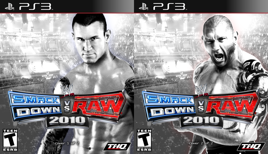 King of Kings No drawing from Diablo. |
|
|
|
Post by TC on Apr 22, 2010 18:40:56 GMT -5
Any votes?
|
|
|
|
Post by King of Kings on Apr 22, 2010 18:56:45 GMT -5
I'll be voting soon, I haven't yet because I don't wanna half-ass it, you know what I mean?
|
|
|
|
Post by Alex on Apr 22, 2010 19:24:58 GMT -5
Championship
TC: Love the warm and cool colours on either side, especially the image of the giant in front of the burning house, the centre image goes well too and the clown dude on top caps it off really well
Emasson: Looks good but it doesnt stand out as much as TC's, maybe the images in the letters could be more visible? might make it pop more
Vote: TC
Drawing match
Hurricane: Very interesting effect you did with the coloured pencils in the jacket, it looks like its shining or something its really unique looking. The face looks awesome too
Exhibition Match
Diablo: I would have easily thought thiswas a real cover, so good work. The logos on the bottom really add to the authenticity
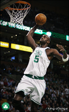
KOK: i think the effect on the wrestlers looks very cool in the way it makes their tats stand out, but as a cover it doesnt look as authentic, the Batista one maybe but the image of Orton is a little boring
|
|
|
|
Post by Hurricane on Apr 23, 2010 0:29:00 GMT -5
Ill vote sometime over the weekend.
|
|
|
|
Post by King of Kings on Apr 23, 2010 16:45:18 GMT -5
My Vote: TC for sure. I could make this easy and just say, I freaking love The Devil's Rejects...but I like the overall design. The hanging logo, the split background with the mugshot images...eMasson, I like yours but I feel like the images of the fighters are too transparent..
|
|
|
|
Post by TC on Apr 23, 2010 19:02:38 GMT -5
Good luck eMasson,  I really like it Josh. It has a cool overall look. And Joker looks cool. I like both of these. KOK, I see where your going with one side being Raw and the other being Smackdown. But i think the glow should stand out more to make it clearer that one is Raw and the other is Smackdown. Or something like, how on both cases in the background it says Smackdown, one could be Raw to make it more obvious. I prefer the arena background over Diablos background, but the overall look of his seems more like something you'd actually see in the store because it looks a lot like the normal SvR cases. Maybe if you had more people on yours, KOK then I would've voted for you. Diablo's just looks more professional i guess, or more like the average case. Nice job to both of you though. |
|
|
|
Post by Masson on Apr 26, 2010 11:04:51 GMT -5
My vote is to Diablo, but I do like yours KOK. I just don't like the fact that it is monochrome. Diablos looks a bit odd how HHH and Taker are just standing there, but edge is in motion, making it look lopsided.
And I should be able to make a decent peice in the next show, as my PC is up and running. Somehow, the battery got waterdamaged (even though it hasn't been outside since I got the damn thing, due to the cracked monitor) but nayways, it still turns off occasionally, but I can live with that, just save it alot. So yeah, I will participate next show.
|
|
|
|
Post by TC on Apr 26, 2010 15:35:38 GMT -5
Cool.  |
|
|
|
Post by TC on May 1, 2010 15:02:33 GMT -5
Winners:
- TC
- Diablo
|
|