|
|
Post by Attitude Adjusted on Apr 25, 2010 7:35:55 GMT -5
|
|
|
|
Post by Hurricane on Apr 25, 2010 7:44:39 GMT -5
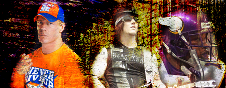
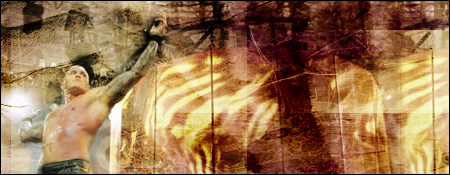
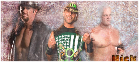
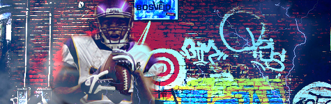
I think theres too much going on in them. The SES ones focal is good, but the background is a mess and doesnt suit it. Same with the Hardy one and the Orton one. Football one is good and one with Taker/HBK/Kane is good too.
|
|
|
|
Post by Attitude Adjusted on Apr 25, 2010 7:50:28 GMT -5
I see. Thanks for the comments.
|
|
|
|
Post by Attitude Adjusted on Apr 25, 2010 7:52:31 GMT -5
And the background of the Orton is the circular titantron from his WM match when he did that pose.
|
|
|
|
Post by TC on Apr 25, 2010 14:22:35 GMT -5
Yeah I can't say I really like any of these. There's way to much going on in them. The Hardy one is probably my favorite, it's just too busy looking.
|
|
|
|
Post by King of Kings on Apr 25, 2010 16:05:33 GMT -5
I think you're using the feather tool too much. If it IS the feather tool. I used to use that a lot when I first started but I hate using it now. That Jeff Hardy graphic, and the one with HBK, Kane, and Taker, could be so much better if they didn't have the feathered/blurred edge.
|
|
|
|
Post by Attitude Adjusted on Apr 26, 2010 3:52:51 GMT -5
I never use the feather tool.
|
|