|
|
Post by AC on Jul 25, 2010 15:20:00 GMT -5
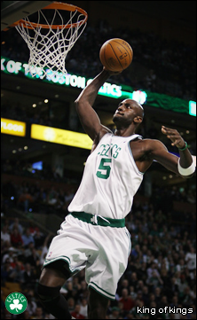
 Just got photoshop cs4 on my new computer so i'm just trying it out |
|
|
|
Post by King of Kings on Jul 25, 2010 15:31:46 GMT -5
Nice dude! The colors are great, obviously symbolizing the nexus. The only thing I don't like is the squashed images on the side. It would've looked better with just black bars or something. But still, I like it a lot man.
Stick with CS4. Don't get CS5 btw, IMO it's very buggy.
|
|
|
|
Post by Masson on Jul 25, 2010 16:39:26 GMT -5
I think it would look a lot better as two seperate images, spilt in half along the horizontal middle of it, so that in the top image, you get the yellow bar with the text in it at the bottom of the picture... If you understand me  It looks odd to me, as it's hard to pick out a focal point, making it seem over complicated. I think one of the main points in art is to only have one focal point, and with bold text like you have, you have made two sections which are very dominating, pretty much creating two focal points. I also agree about the squashed images either side, you really should have used scaled images, stretching/skewing looks really bad, imo. You could perhaps replace those images with smaller images, or each of their finishers? Still, looks nice, I like the colours and the filter effect you have put over it. It fits really well with the NXT. |
|
|
|
Post by AC on Jul 25, 2010 16:59:31 GMT -5
Thanks for the suggestions you two. I will work on an updated version soon.
|
|