|
|
Post by Hurricane on Oct 26, 2010 4:05:31 GMT -5
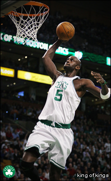
 Main Event: Main Event:King of Kings vs. TC Stips: FreestyleKing of Kings:  TC:  Opening Match: Opening Match:
Jake_666 vs. Diablo
Stips: FreestyleJake_666:  Diablo:  |
|
|
|
Post by Diablo. on Oct 26, 2010 4:14:31 GMT -5
King of Kings: Not a fan of this, tbh. Like... it's original and all... but the shading and anti-aliasing just isn't doing it for me. Nice try, though.
TC: This is alright. Shading is very flat though... pretty much everywhere. Face looks awesome, though.
Vote: TC
|
|
|
|
Post by Hurricane on Oct 26, 2010 4:35:21 GMT -5
KOK, I like this as much as any of the other Power Rangers, but honestly, im growing tired of them. They were a huge step up when I saw the first one, but now I've seen so many from you that I don't know if they are still improvements; and basically, im just urging you to make something different. Shading could be a TINY bit further apart between shades, but apart from that, it's solid.
TC, I like it, but as said, its very flat. I've had the same monitor problems before, so I fully sympathize with how hard it is under those circumstances. Nice try, I like Slash and its a pretty decent micro of him. My only suggestion is to make the greys/blacks slightly further apart from now.
My vote: TC
_________________
Jake, I like it, apart from a few things. 1) its a bit too reminiscent of Monja's (the hair, for example). and 2) the legs are WAY too short and it throws the whole thing off. I can tell you put a lot of effort and detail into it though.
Diablo, I really like this, except the shading on the coat and shirt under it is lacking severely in places. Apart from that, its great.
My vote: Diablo.
|
|
|
|
Post by King of Kings on Oct 26, 2010 7:51:10 GMT -5
I'm getting beat by a micro of Slash, how ironic.
|
|
AVCore
Backyarder
 MS Cruiserweight Champion
Posts: 245
|
Post by AVCore on Oct 26, 2010 10:53:23 GMT -5
Main Event:
King of Kings vs. TC
Kok: Pretty decent power ranger but it feels too familiar and doesnt really jump out at me.
TC: Pretty nice,clothing isnt shaded very well but head looks great.
Vote TC.
Opening Match:
Jake_666 vs. Diablo
Jake: Its nice,I know weve seen the idea done before but the cards was a nice spin on it. The proportions are totally fucked though.Head looks a bit too big for the body,which looks WAY too big for the legs. Everything is done well,but that just really kills it for me.
Diablo: Looks nice,coat looks great but the outer edges of the arms should be shaded more I think. Really like how some of the othr shading looks though,mask looks great too.
Vote : Diablo.
|
|
|
|
Post by TC on Oct 27, 2010 1:16:58 GMT -5
Diablo gets my vote here. I like that Jake posed it and added the cards but the proportions really throw it off. The legs are way too small, and I don't like that his facial expression looks like someone farted in his mouth. Rorschach turned out pretty well. Needs some AA and I don't like the pants shading but it's still better.
|
|
|
|
Post by Hurricane on Oct 27, 2010 4:56:41 GMT -5
Diablo and TC win. 1 point each.
|
|