|
|
Post by AC on Jul 18, 2011 4:17:28 GMT -5
Here is the new one 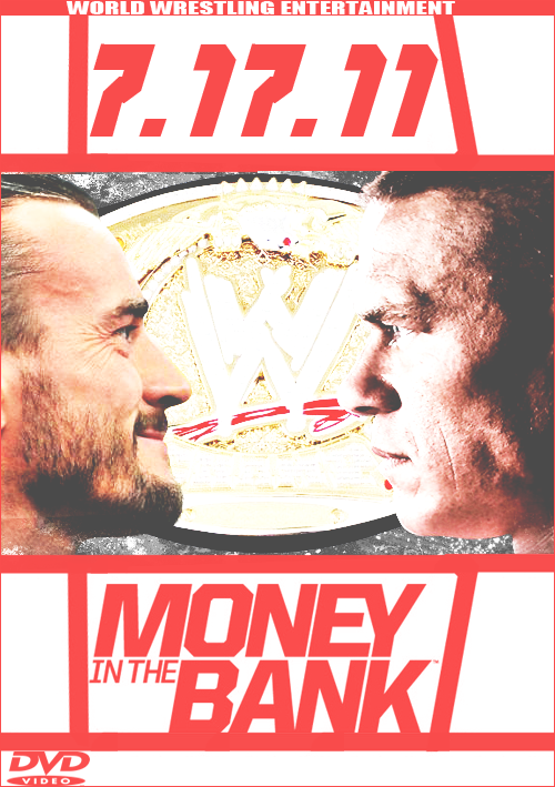 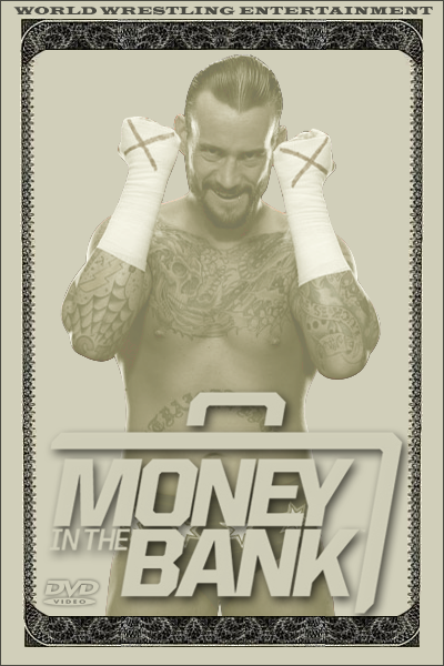 Going to be making a back cover too |
|
|
|
Post by Diablo. on Jul 18, 2011 4:27:58 GMT -5
I like the idea of the design, however the execution is kind of poor in terms of quality (the money outline looks blurry and the outline of Punk is kinda rough). Still, pretty cool.
|
|
|
|
Post by Masson on Jul 18, 2011 5:19:31 GMT -5
Agreed, it's a godd concept but could be executed better. Looks a little bland to me, you could possibly have put more details on the money?
|
|
|
|
Post by AC on Jul 18, 2011 21:37:50 GMT -5
Made new one
|
|
|
|
Post by Diablo. on Jul 18, 2011 23:07:11 GMT -5
I'm really hating to be "that guy", but once again, the idea is good (not as good as the original), but the execution isn't in terms of over-contrasted and overly-bright.
|
|
|
|
Post by Next Generation on Jul 20, 2011 2:09:00 GMT -5
I really like the first one actually, it could be darker though all together, the 2nd one is good but very 1 dimensional
|
|


