|
|
Post by AC on Mar 15, 2012 15:08:48 GMT -5
Just finished making this and overall I like how it turned out. The layout was inspired from a WWE Allstars poster I saw at one time 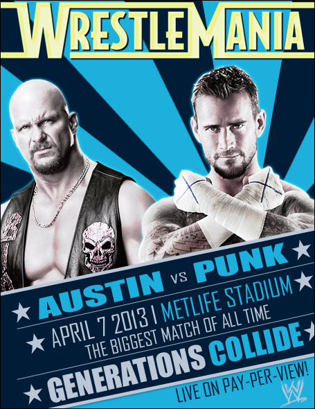 |
|
|
|
Post by Diablo. on Mar 15, 2012 21:59:10 GMT -5
I really like it, I just don't like the WrestleMania logo up top. I'd have it with all the other text, using the actual WrestleMania 29 logo.
|
|
|
|
Post by Next Generation on Mar 15, 2012 22:37:40 GMT -5
Its really neat AC, the Mania logo would be better if it were all white with some light grey shading but thats just my opinion and thats really the only thing i can critique.
|
|
|
|
Post by AC on Mar 16, 2012 0:41:49 GMT -5
Thanks guys and yeah I wasn't feeling the logo but the official one looks kinda out of place on the poster and I couldn't find a good spot for it. I'll do some edits here in a bit
|
|
|
|
Post by AC on Mar 16, 2012 0:48:49 GMT -5
Here's one with a plain white logo 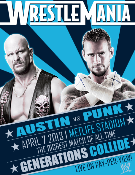 |
|
|
|
Post by Next Generation on Mar 16, 2012 3:22:09 GMT -5
10/10  |
|
|
|
Post by TC on Mar 16, 2012 3:54:36 GMT -5
The white looks much better. I love the poster design, man.
|
|


