|
|
Post by MoNjA. on Nov 8, 2009 6:24:32 GMT -5
|
|
|
|
Post by waynev1 on Nov 8, 2009 6:33:33 GMT -5
To be fair, it's not that bad overall I really like the head and the coat thing that you have made overall a really nice micro keep it up because in my opinion you might become a great micro maker!
|
|
|
|
Post by dean28 on Nov 8, 2009 8:31:44 GMT -5
I like it the coat looks realy good as do the gloves. The head pritty good too. Cant wait for more
|
|
|
|
Post by MoNjA. on Nov 8, 2009 9:25:13 GMT -5
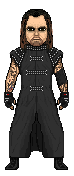
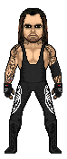
New taker added without the coat.
And thanks for the comments.
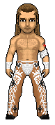
EDIT:Shawn added.
|
|
AVCore
Backyarder
 MS Cruiserweight Champion
Posts: 245
|
Post by AVCore on Nov 8, 2009 10:14:23 GMT -5
They look pretty good.On the HBK one I think the tattoo should be coloured darker so it blends in more.The inside legs are shaped kinda weird too.
Taker I really like but the boots are a little messed up.
Good work.
|
|
|
|
Post by Alex on Nov 8, 2009 11:02:43 GMT -5
Assuming your new to these, It’s a really good start. I can see a decent amount of resemblance in each of them, good to see your already modding facial features n all that. I really like the coat on Taker, especially. Some tips for improvement with these ones:
-Some of the shading looks kinda sporadic and random, but you’ll get the hang of it with more practice.
-Make the shape of HBK’s pants a bit straighter, rather than ballooning out at the knees
-Black outlines around the wrist tape and where the pants meet the waist would keep it a little more consistent with the rest of the micro
-Incorporate Anti-Aliasing around spots where the tights meet the skin (ex: around Taker’s chest) and around the designs on the tights
|
|
|
|
Post by TC on Nov 8, 2009 22:24:30 GMT -5
The resemblance in both of these is very good. I'm not sure how long you've been making micros, but either way these two are pretty good. The shading is quite random in some spots but it's not terrible. I dislike how HBK's outline is entirely black but the outline of the waist part of the pants and the top and bottom part of the tape has a different color outline. Tattoos could also use work.
Nice job dude.
|
|
|
|
Post by Hurricane on Nov 8, 2009 23:25:13 GMT -5
Not bad at all. I like how your modding and making them different, as it makes them stand out. Just try to make the shading less blurry. Make every shade further apart so it stands out as dynamic. Good work!
|
|
|
|
Post by the rising underdog on Nov 9, 2009 0:05:58 GMT -5
love the outfits but the face look like a little work is needed
|
|