Post by Alex on Nov 14, 2009 20:03:47 GMT -5
Im not great at explaining things but i tried putting together a tutorial of some common mistakes and techniques used to resolve them. Copying them into paint and zooming will give a clearer at these, if you have any questions feel free to ask
Shading

1.This demonstrates pillow shading, which is generally frowned upon, and makes your shading look sloppy and unrealistic. The effect is made by continually following the outline or shade with another shade.
2.Demonstrates cleaner, smoother shading. Rather than following the previous shade, lighter shades are used to blend the darker ones, keep reading for further info on blending
Blending/Anti-Aliasing
1.This example shows no blending on the outside of the shirt. This creates a sort of rough look to the lines.
2.Again, this shows pillow shading, which can look worse than simply not blending the shirt at all. This is especially noticeable when both sides of the line are pillow shading, because it makes the lines look noticeably thicker
3.To get the blended effect, simply transition the shades from light to dark along the edges, subtly blending the black lines
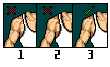
Blending Between Colours
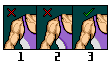
1.Shows no blending, depending on the colours used, this is sometimes more noticeable then others.
2.Another example of pillow shading. This disrupts the transition between colours, making a distinct separation between the two, rather than a smooth transition
3.Shows a smooth blending effect to the colours, this can be tricky to get a handle on. To do so, you have to find colours that compliment the two being blended, in this example purple and white. In this case, a duller purple will level out the two colours.
Shading
1.This demonstrates pillow shading, which is generally frowned upon, and makes your shading look sloppy and unrealistic. The effect is made by continually following the outline or shade with another shade.
2.Demonstrates cleaner, smoother shading. Rather than following the previous shade, lighter shades are used to blend the darker ones, keep reading for further info on blending
Blending/Anti-Aliasing
1.This example shows no blending on the outside of the shirt. This creates a sort of rough look to the lines.
2.Again, this shows pillow shading, which can look worse than simply not blending the shirt at all. This is especially noticeable when both sides of the line are pillow shading, because it makes the lines look noticeably thicker
3.To get the blended effect, simply transition the shades from light to dark along the edges, subtly blending the black lines
Blending Between Colours
1.Shows no blending, depending on the colours used, this is sometimes more noticeable then others.
2.Another example of pillow shading. This disrupts the transition between colours, making a distinct separation between the two, rather than a smooth transition
3.Shows a smooth blending effect to the colours, this can be tricky to get a handle on. To do so, you have to find colours that compliment the two being blended, in this example purple and white. In this case, a duller purple will level out the two colours.