|
|
Post by TC on Feb 18, 2010 17:18:30 GMT -5
 Number One Contenders Match Number One Contenders Match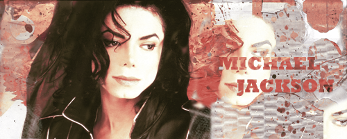 Attitude Adjusted  King Of Kings  thehytman ------------------------------------------------------------------- Exhibition (Non-Title) Match TC (c)  eMasson  thehytman  Shaun Really good turnout, I'm glad everyone turned in their stuff.  |
|
Shaun
Backyarder

Posts: 198
|
Post by Shaun on Feb 18, 2010 18:18:43 GMT -5
Holy...shit i didn't expect everyones to be THAT good haha, wow i outta up my work some time =x.
Number one contenders:
All really good, AA's blending and replacement of render/ stock is very nice, and appealing to the eye. KOK's is fairly simple, but effective, which is always a good combination. The background stock's desaturation was a great way to bring out the focus upon the main render nice job. Hytman's, well what can i say, a very unique graphic, i love it, the entire concet of the stock clipped over the text is really cool and i may have to take that idea in my future graphic work, the text underneath is also really nicely done and positioned.
Vote: thehytman
Exhibition match, well i can't vote but i do believe i'm entitled to say that all kick ASS, minus mine lolz. I think the Killers one is especially awesome, its so simple and clean, great work. Hytmans is also uber sexy the effects are hardcore badass. Tyluh, that lightning style design is the sexbomb, really nice graphic also.
Thumbs up to everyones work. Seeing these has really inspired me to get back into photoshop, so yeah nniiicee jooobbbb.
|
|
|
|
Post by King of Kings on Feb 18, 2010 18:34:13 GMT -5
All I have to say is FUCKIN AMAZING job to Attitude Adjusted and thehytman in our match. You guys are gonna make me step up in the future. I'm liking where this is going. In the exhibition match, everyone freaking owned. I love everything. TC, It's great. I love Lil Wayne (no homo) so I naturally like this graphic. The lightning and the colors are sick, and it's blended nicely. Only piece of advice I can give, which I learned as a Media Technology major, never use the default bevel/emboss or outer glow effect on fonts. It makes them look cheesy. Use the sliders and fuck around with it til' you've got a nice blend, I dunno how to describe it. We were banned from using bevel/emboss though, if we did we'd get a full letter grade drop on projects. Here's one of the first sigs I ever made back when I was probably 14, so 5 years ago:  and as you can see I used Bevels up the ass, making it rather shitty. Looking back, I dunno how I ever thought that was good. Avoid bevels, and you'll be more pro then you are dude. eMasson, I like it. Alot actually. I don't really like The Killers as much as say Lil Wayne but I like the box look and the guitar crossing over, the logo is cool too. My only problem is the stroke is too thick and the shadow is too dark, but hey, maybe it's just my taste in art. It looks great regardless. thehytman, jesus dude you're pretty good at GFX. I love the effects on this, including the fractal lighting in the back and the orb style effect. Could've used a thin, 1pt stroke on the outer edge, which if you're unsure how to do, simply merge all the layers into one layer, go to Edit, and then stroke, and put a 1pt/px stroke on the Inside. If you already know how to do it, maybe someone who doesn't can use that advice. Shaun, really nice job, it's simple but effective. If you had used a one point stroke on the edge rather than what looks like a 2 or 3 you would've had my vote. My vote goes to: thehytman EDIT: mind you, I'm no pro or anything. I just have a vocational degree in Media Technology. I'm only doing those crits because I wanna see everyone get tons better. |
|
Shaun
Backyarder
Posts: 198
|
Post by Shaun on Feb 18, 2010 19:08:30 GMT -5
You...would've voted me if i would've had a 1 pixel border? Wow, i didn't know borders mattered that much =x.
|
|
|
|
Post by King of Kings on Feb 18, 2010 19:42:11 GMT -5
I didn't mean to sound so cynical or anything lol, sorry. It does matter a bit though, it kinda provides sort of a definition to the outside edge of the image.
|
|
Shaun
Backyarder
Posts: 198
|
Post by Shaun on Feb 18, 2010 21:23:59 GMT -5
No need to apologize, its your opinion your entitled to it, i just never known anyone who gave a rats ass about a border before haha, s'all good d00d.
|
|
|
|
Post by Attitude Adjusted on Feb 19, 2010 2:25:07 GMT -5
Thanks for the good feedback guys.
|
|
|
|
Post by H Y T M A N on Feb 19, 2010 15:51:40 GMT -5
@john; I gave you my opinion of Michael in your showcase King of Kings; I'm really not a big fan of borders, especially borders that go around the whole sig and are very thin lol. IMO, they look really ugly and unnappealing. The only borders that I use are about 6-7 pixels on the top and bottom only. Gives it a cinematic effect lol. Thanks for the tips anyway, mate. Now, I like your graphics, but in this case, I'd move the text closer to the left, and use a different Background picture. Two focals is a hard thing to work with, and by using anopther one you then need to blend them both together so they flow. Once again, this is just my opinion and hopefully you take these on board next time TC: I like the lighting in the BG as an effect, and the colours are pretty hawt, but the main focal needs blending and the text should never be put in the far corner, unless for an LP. Just my opinion again lol xD. eMasson; A very simple, kinda-whored out sig lol. Its very simple to make, but the showcase of this one is brilliant. I love the text and the font you used, however I believe that the 'The" looks a bit out of place. Shaun; I believe I gave feedback in your other topic, if you want more than just respond Nice posts by all, unfortunately I can't vote, so we need to get some new recruits voting lol. |
|
|
|
Post by Hurricane on Feb 19, 2010 17:10:01 GMT -5
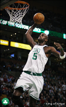
All of these surprised me, as they are all fantastic. AA, I like it alot and it works fine, but its a bit dull compared to the others. KOK, AMAZING Eddie Guerrero tribute. Looks great and actually something like what WWE would use. Only thing I don't like is the square texture on the background, as all it achieves for me is make it look jpeg. Hytman, very original and very neat looking. I like it alot and don't have a CLUE how you would go about doing that.
My vote: Hytman
__________________________
TC, not bad but also nothing special. Some cool effects here, but it looks kind of monotone purple. Having Wayne stand out and be more towards the normal colour would help that. eMasson, I LOVE that and thats an understatement. It's so crisp and flows well, looking extremely professional. Hytman, not bad at all. Pretty cool effects and stuff. Shaun, yours is pretty boring and monotone looking. Not bad per say, just not eye-grabbing, nor anything special.
My vote: eMasson
|
|
|
|
Post by Masson on Feb 19, 2010 18:17:28 GMT -5
Just like to point out, I didn't use any font, that is old official killers logo. The new one is just the letter K from the logo I used... So Yeah...
|
|
|
|
Post by TC on Feb 25, 2010 2:49:33 GMT -5
Winners are hytman and eMasson. hytman, you'll get your title match at the next show when I get around to making a card. Sorry I couldn't get around to voting, having problems with my kidneys. I can honestly say though, everyone made a great graphic. Next card probably won't have as many competitors so there will be more votes.
I'll try to get the next show card up by this weekend.
|
|
|
|
Post by Hurricane on Feb 25, 2010 5:01:53 GMT -5
This is still in its growing stages and has been great so far, in my opinion. Though not many are participating, those who are show a lot of interest and it will surely grow steadily. You could possibly just even run an MBL every single week between 2/3 people until more and more people get involved. Doing good so far, though.
|
|
|
|
Post by King of Kings on Feb 25, 2010 9:53:38 GMT -5
Yeah definitley. I'm down to participate in the next ones, so book me for sure man!
|
|
|
|
Post by Attitude Adjusted on Feb 25, 2010 10:36:50 GMT -5
Yeah, me too for the next one.
|
|
|
|
Post by Masson on Feb 25, 2010 10:43:37 GMT -5
Wow, joint winner.... Although, when it's said like that, it sounds like you guys are running a drug competition lol.
And I am definitely in for the next one.
|
|