|
|
Post by King of Kings on Mar 10, 2010 0:39:03 GMT -5
I started this signature aprox. 40 minutes before this post. Let's say that the drafts were 10 minutes apart. I just wanna illustrate, that when you finish a graphic for the first time, take it and tweak it and you'll come out with something cool. For the most part, it's just font changes but still, a font can make or break the graphic. 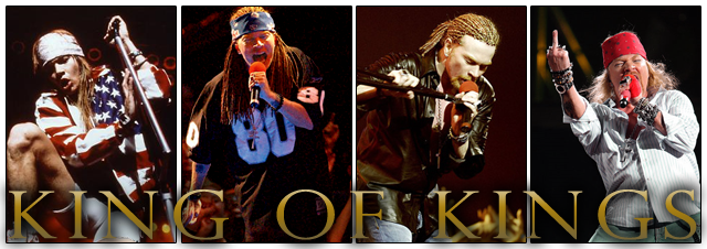 Here's the first draft. Not terrible. The font needed some variety though. 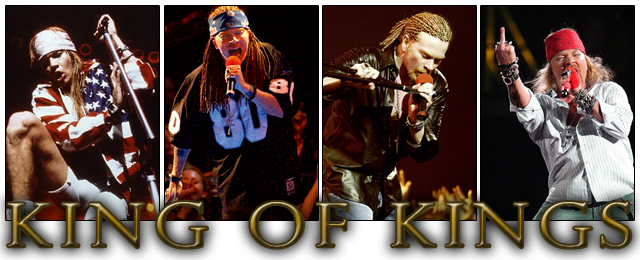 Now I moved the text down a bit and added some effects. It was sort of over kill.  A little different, taking away some of the effects and making sure it was effective and well placed. 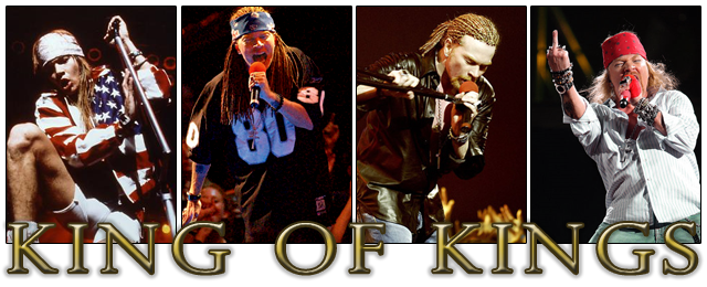 Here's the final draft, just had to brighten up the text so it has a nice contrast against the background and here we go, the final version of my sig. What do you guys think?! |
|
|
|
Post by Hurricane on Mar 10, 2010 16:18:47 GMT -5
I like it. The font looks kind of jpeg to me? Might just be me, but the images of Douche Axl look really clean and crisp, and the font seems find of pixelated. I like it though, especially how the font sits off the image.
|
|
|
|
Post by TC on Mar 10, 2010 16:51:07 GMT -5
I really like it. The font on the most recent one is really what brings it to life. The picture choices are all great. Simple, but cool graphic. Nice job dude.
|
|